Monday, December 31, 2012

Cotton's Candy

Today I break my “no living artists” rule once again to bring you the 2012 oil painting Ruin by Will Cotton.

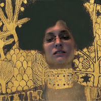
Will Cotton, Ruin, 2012, oil on linen, 86.4 x 61 cm.

Will Cotton is known for his naturalistic Candy Land landscapes. With each painting, he creates a lavish utopia where perfect pinup girls lounge around all day. They seem to have no needs or wants, but no substance either. The entire world exists only to make our mouths water. The whole thing is a little obscene. But while it might not be healthy to live there (there are no vegetables or meat to balance out the sweets), it’s fun to explore. I love when familiar things, like molasses and candy canes, become other familiar things, like swamps and trees. And anyway, it’s the rot just under the surface that makes Cotton’s work intellectually stimulating. It’s what distinguishes his form of sickly-sweetness from the sickly-sweet clichés of Thomas Kinkade.

I chose Ruin for a couple of reasons. First of all, it comes from a group of paintings where you can actually see the slow decline of Cotton’s world, like tooth decay caused by too much sugar. There are candy neighborhoods being swept away in pudding floods, landfills packed with chocolate doughnuts and pastries, and of course derelict gingerbread houses. But look carefully at Cotton’s paintings, and read the titles! The decomposition might not be obvious at first!

With Ruin, the first thing you notice is the fog. It gives everything a faded, eerie quality that serves to keep the viewer at a distance. For me, the mere fact that it’s a gingerbread house does that too. While I love the creativity that goes into them, I’ve never actually had the desire to eat one. I wouldn’t even know where to start. At the same time, the intrigue of broken candy cane columns and a large hole in the cookie roof draws you in.

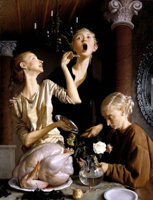
Up until now, I could just as easily have been describing Cotton’s 2007 painting Ghost. The two paintings are essentially mirror images of each other. But I think Ruin has something special that Ghost is missing. And that’s a way in. Instead of having an even coating of fog across the composition, Ruin has an opening near the bottom where the intense reds and greens of candy canes and the dark of a shadowy doorway peek through. Imagining we’re inside the painting, the opening is at about eye level. It’s as if Cotton is inviting us to go inside and have a look around.

Will Cotton, Ghost, 2007, oil on linen, 182.9 x 121.9 cm.

I first learned of Will Cotton while I was in New Paltz getting my bachelors degree. I don’t really remember any specifics. I had no idea he existed one day, and then I did. One thing I didn’t know was that he grew up in New Paltz (although that explains why there was a Will Cotton painting hanging behind the circulation desk the one time I ventured into the town’s library). I learned that when I was an intern at New York’s Museum of Modern Art and had the opportunity to attend a special “interns only” artist’s lecture at Sotheby’s. I also learned that he makes big, detailed maquettes, or models, of his candy landscapes (using actual sweets!) before painting them. Apparently, he’s become quite the baker, and his studio always smells like cake.

A lot of you are probably already familiar with Will Cotton too, even if you didn’t know it. Lately he’s been experimenting with media outside painting. There’s been sculpture, stage design, fashion . . . . He even opened a temporary bakery, selling sweet treats on the cheap. But he’s most known for Katie Perry’s “California Gurls” music video. He was the art director and is responsible for the legions of gummy bears and cotton candy clouds. Since then, Cotton-inspired ads have been popping up in magazines and commercials everywhere.


But overall, what I like most about Will Cotton's work is not the surrealistic world made out of candy and cake. It’s that he makes the surrealistic world seem not so surrealistic. It just seems real.

Saturday, December 29, 2012

Klimt Mini Post

I have a post on a work of art that fits with the snowy holiday season all ready to go. But first, a little more on Klimt and Adele.


The picture above shows Adele Bloch-Bauer I as it’s framed and reproduced by the Neue Galerie. I want to know why. What’s with the frame-within-a-frame and the white strip underneath? Does it have some sort of historical or artistic significance? Is it original to Klimt? Did the Bloch-Bauer’s hang it like that? I tried to look it up, but I couldn’t find any mention of it’s framing. If you have any ideas please let me know in the comments!

I also found a silly little website where you can insert yourself into a Klimt. It’s surprisingly entertaining, so go “Klimt Yourself!”

Me as Judith I

Yeah, not much actual substance this time.

Monday, December 17, 2012

Klimt's Golden Lady

I used to hate Klimt. All I knew was The Kiss, or Kuss in German. And while it’s grown on me a bit, it’s still not my favorite. Something about that thick man-neck and the guy’s obscured, caveman-like features. And the impossible angle of the woman’s head. Also, that robe the man is wearing (although it’s interesting to note that it looks similar to the ones Klimt himself went commando underneath). Basically the whole man and how he seems to be interacting with the woman. He looks predatory and unstable.

However, Gustav Klimt’s 1907 painting Adele Bloch-Bauer I is one of my favorites.

Gustav Klimt, Adele Bloch-Bauer I, 1907, oil, silver, and gold on canvas, 140 x 140 cm.

I first noticed Adele Bloch-Bauer I while I was in graduate school. It was the go-to example when talking about Nazi-Era provenance issues. I thought it was beautiful. Painted during Klimt’s “Golden Phase,” the work is an art nouveau/symbolist masterpiece with influences as diverse as early Byzantine mosaics and Egyptian and Mycenaean art. What I love about it is the way the perfectly modeled face, shoulders, and arms emerge from abstraction. Klimt has covered the rest of the figure (i.e. the clothing) and the background with flat, detailed pattern, a practice known as horror vacui, or “fear of empty space” in Latin. I also like the awkward position of Adele’s hands, which Klimt apparently did to hide a deformed finger. Overall, the painting is opulent, mysterious, and wonderfully bridges the art of the 19th and 20th centuries.

Now, since it’s become such a big part of the work, I thought I’d tell you a little bit about the painting’s history and the reasons why it’s the go-to example when talking about Nazi-Era provenance issues.

Adele Bloch-Bauer I was originally commissioned in 1903 by Austrian/Jewish sugar magnate Ferdinand Bloch-Bauer (né Bloch) and depicts his wife Adele Bloch-Bauer (née Bauer). She was incredibly independent for her time. Although she looked fragile on the outside, she was active in the Austrian art scene, loved learning and the pursuit of knowledge, and carried a gold cigarette holder at a time when women didn’t smoke. It was even rumored that she had an affair with Klimt! She was basically an Austrian Isabella Stewart Gardner (if you don’t know Isabella, look her up. She’s awesome).

Adele Bloch-Bauer

Adele died of meningitis in 1925. In her will, she asked her husband to donate Adele Bloch-Bauer I along with a couple other Klimts to the Austrian National Gallery upon his death. But before that could happen, Nazi Germany annexed Austria, and Ferdinand fled to Switzerland, leaving all of his possessions, including the Klimts, behind. Eventually, the Nazi’s divided up and sold the Bloch-Bauer’s property and occupied their home. Although the Nazi’s considered other Viennese artists of the era “degenerate” and banned them for being un-German, they liked Klimt. The Nazi’s renamed Adele Bloch-Bauer I The Lady in Gold to hide its Jewish origins and placed the painting in the Austrian Gallery.

Ferdinand died in Switzerland in 1945. He had lost nearly everything in the Holocaust and had no children of his own. In his will, he bequeathed his estate to his nieces and nephew (Ferdinand’s brother had married Adele’s sister). After the war, they recovered some of Ferdinand’s possessions, but the Austrian government refused to return the Klimts. They argued that Adele’s will gave them legal ownership after Ferdinand’s death. But, as we know, Ferdinand, not Adele, owned the Klimts. He had commissioned them, and while he may have wished to respect Adele’s request, he was not obligated to.

In 2000, Maria Altmann, Ferdinand and Adele’s last surviving niece, sued Austria from the United States, where she lived in California. The case went to the United States Supreme Court and was arbitrated by a panel of three judges in Austria. In 2006, Adele Bloch-Bauer I and four other Klimts were returned to Altmann and the heirs.

Soon after its return, Maria Altmann sold Adele Bloch-Bauer I to Ronald Lauder of the Neue Galerie in New York City for the record-breaking sum of $135 million. The museum’s director calls it their “Mona Lisa.” The work people will come to see. And it works. That’s why I ended up there.

Saturday, December 8, 2012

House Sitting, and Interviews, and Road Trips, Oh My!

With Thanksgiving, and house sitting, and interviews, and work, it's been a busy couple of weeks. And it's not over yet! My husband and I are driving down to Alabama in the next day and a half for yet another interview. We might even make a stop or two on the way back and have some fun. I'm sorry I didn't post anything last week, but I won't be posting anything today either. I do have a couple of things in the works, and I promise (cross my heart and hope to die) that I will be back next week with a post on Gustav Klimt.

But NOT The Kiss.

Wednesday, November 21, 2012

Currin's Turkey

I feel uneasy when it comes to adding works by living artists to my precious “1perArtist” folder. I love contemporary art, but what happens when an artist inevitably creates a work that’s better than the one I originally chose? Going through the process of choosing art and saving it to my computer seems so final. I’m committing myself to this one painting, or drawing, or sculpture, or whatever it happens to be. I know it’s not really like that. That it’s easy to go back and reexamine an artist at anytime. That, in fact, that’s what I should be doing even for those that are long dead. But I usually don’t. No matter how much I love or admire a living artist, I’m usually too conflicted and end up completely ignoring them.

Not today. Today I’m going to talk to you about John Currin, an artist who is very much alive and very much awesome. The work I chose is his 2003 oil painting Thanksgiving. I figure that if I’m going to break my “no living artists” rule, it might as well be to show you a Thanksgiving painting the day before Thanksgiving.

John Currin, Thanksgiving, 2003, oil on canvas, 172.9 x 132.3 cm.

John Currin is an American artist who is best known for his sardonic paintings of women. In the early years, he focused on the impossibly busty and the creepy, cartoon-faced men who woo them. Now, his paintings are downright pornographic. Seriously. Porn. But, while Currin has often been accused of sexism, I think there may be something more to his work. I don’t think he’s making clichéd, fetishistic paintings just because he’s an infantile perv. I think that by showing us the images he does, he makes us stop and think about political correctness, our society, and our own attitudes. Plus, I love figure painting, and Currin’s a technically adept figure painter in a time when “real artists” are supposed to work with belly button lint and formaldehyde (although there’s nothing wrong with that either).

Thanksgiving depicts three eerily similar looking women with super skinny waists and giraffe-like necks gathered around a giant, raw turkey. They look like they could be different ages, but that could also be chalked up to the angles. The painting itself is firmly situated within art historical traditions, although it can be a bit tricky to figure out which ones. In typical postmodern fashion, Currin mixes and matches visual references as diverse as classical architecture, surrealism, and Norman Rockwell. But the most obvious reference is to Dutch genre paintings and still lifes. Like a Rembrandt, pale figures emerge from a dark brown background. The elaborate mirror and hanging candelabra suggest The Arnolfini Portrait by Jan van Eyck. The blackish-purple grapes, dry onion, and wilting flowers point to Pieter Claesz still lifes. They may look perfect at first, but then you see little rotting bits of fruit, or half eaten pies, or bugs.

Jan van Eyck, The Arnolfini Portrait, 1434, oil on oak, 82.2 x 60 cm.

In the 2006 book John Currin, Currin explains that he considered Thanksgiving in its original incarnation to be a failure. Lucky for us, he gave it another shot. It turns out, his muse for the revamp was his wife Rachel Feinstein, a sculptor in her own right. She was pregnant at the time and posed for all three women. In the end, Thanksgiving took exactly nine months to complete and became a sort of allegory for her pregnancy.

Not being privy to Currin’s private life, I see it differently. To me, Thanksgiving looks like a stage set. The three women are bumbling about playacting something they seem to have no real experience with. Props are crowded into the picture plane, and the women’s expressions are incredibly theatrical. The woman in the middle seems to be tasting something out of an empty spoon (although her mouth makes it look more like she’s singing than eating). The one on the left, holding the spoon, is also carrying a pot lid, apparently just for looks. At first glance, the woman in the lower right seems to be doing some real work. But no. She’s just staring at a grape she’s holding between her thumb and index finger. The whole scene is some sort of absurd mystery that makes me do a double, triple, and even quadruple take. Maybe the women have cooks and servers to take care of Thanksgiving preparations for them, but they want to put on a good show?

All in all, Thanksgiving is more subtle than a lot of Currin’s work. The overall feel that makes a Currin a Currin is there, but there’s less harshness and a complete lack of boobs. And I’m ok with that. While I’m a firm supporter of Currin’s work and think that it’s good when an artist tackles the taboo, some of Currin’s more lascivious paintings can make me a little too uneasy.

Wednesday, November 14, 2012

Dalí's Jewels (and more copyright)

Here’s my Salvador Dalí post. Late again. I’m a bit worried it won’t live up to all the hype, but here it goes.

First things first. After writing about copyright last week, I decided to experiment. I actually asked for permission to use photographs of some of Dalí’s art. First, I contacted the Teatre-Museu Dalí, the museum that owns the pieces I wanted to use. They have a “Rights and Images” section on their website, but after I emailed their Intellectual Property Department, they told me to contact VEGAP, the artist’s rights society that manages Dalí's reproduction rights on their behalf. But, they’re a Spanish organization. After I emailed them, they told me to contact ARS, the group that covers Dalí in the United States. I should have just done that from the start. I was already familiar with ARS and its sister organizations from an internship I did at MoMA.

Anyway, I finally made some progress. I described my blog, specified the images I wanted to use, told them that I believe what I’m doing falls under fair use, and asked them to clarify their policies. In response, they said that what I’m doing generally is not considered fair use (if you open yourself up by contacting a rights organization in the first place, they basically have to say that no matter what), but that they would be willing to waive the fees (thank you!) on three conditions:
  1. The term is limited to one year.
  2. Their copyright credit is included with the Dalí’ works.
  3. The resolution is no more than 1024 x 768 pixels at 72 dpi.
I agreed. Get your Dalí fix now. In a year, this post has to come down. Unless I just get rid of the pictures.

On to Dalí.

He is so much more prolific than I was expecting! I knew about his hyper-realistic surrealism, his melting clocks, his crutches supporting bulbous noses, his spindly-legged elephants, his ants. . . . I even knew about his film where he takes a razor blade to a cow’s eye. What I didn’t know as much about is his photography, his set design, his fashion, his architecture, his literature . . . . He even designed the logo for Chupa Chups Lollipops!

Cheapest way to own a Dalí.

Before I discovered all of these awesome new things, I was going to talk to you about Dalí’s study for Memory of the Child Woman. I love the graphic quality of its squiggly lines, and the isolated areas of subtle color add something great.

Salvador Dalí, Study for Memory of the Child Woman, 1932, 32.5 x 28cm.
© 2012 Salvador Dalí, Fundació Gala-Salvador Dalí,  Artists Rights Society (ARS), New York

But, I changed my mind. I found something better. Today I’m going to talk to you about Dalí’s jewels. Specifically The Living Flower.

Salvador Dalí,The Living Flower, 1959, 39 x 25.2 cm.
© 2012 Salvador Dalí, Fundació Gala-Salvador Dalí,  Artists Rights Society (ARS), New York


Dalí designed his jewels between 1941 and 1970. While New York jeweler Carlos Alemany executed the designs, Dalí chose the metals and handpicked each gem. The Living Flower has a base of dark green malachite with two leafy 18-karat gold stems twisting up out of the rock. The flowers themselves are encrusted with diamonds.


But that’s not the best part. When you look closely, you can see the petals and stamen are shaped like tiny outstretched human hands. On the main flower, each hand reaches up to the sky as if it was grasping at the light. I love representational metalwork, and I love seeing body parts where they shouldn’t be.

You can buy a brooch version of The Living Flower here.

But that’s not the best part either. The best part is that it moves! Hidden inside the malachite is a system of weights and pulleys. When set in motion by what Dalí calls “electrical impulses,” the lower flower's petals slowly unfurl to reveal even more diamonds. It all makes it seem alive. Apparently, Dalí thought of The Living Flower as a metaphor for the artistic process, from conception to creation. “The malachite represents the unknown, latent forces; the gold and diamond flowers, known beauty and creativity.” It’s all wonderfully human and humanly bizarre.

To see a video of The Living Flower and other Dalí jewels go here. Be sure to stick around until the end!

Something else that’s wonderfully bizarre is Dalí himself. Most of us are familiar with his signature mustache, but among countless other eccentricities, he also had a pet ocelot named Babou.

The ocelot in Archer is named after Dalí's.

If you want to see Dalí’s jewels and pay your respects all at the same time, Dalí is buried in a crypt at his Teatre-Museu in Figueres, Spain.

Saturday, November 3, 2012

Musings on Copyright


My computer is back up and running, and I promised you a post on Salvador Dalí. I’ll keep that promise, but before I do, I’m going to diverge a bit from our normal topics to talk to you about an issue that has my head spinning:

Copyright
(Please don’t go away! I’ll try to keep it interesting!)

First, let me give you a brief overview of copyright law in the United States. Lawyers often describe copyright as “a bundle of rights” so we plebeians can understand it better. It includes the right to make copies of a work, the right to adapt a work, the right to distribute a work, the right to display a work, and the right to perform a work. It’s independent of physical ownership and protects books, paintings, sculptures, songs, plays. . . . I could go on and on. But, a work can’t be purely functional. It has to have some sort of creative expression. Also, although it might seem to, copyright doesn’t last forever. Its expiration date depends on when a work was made, whether and when it was first published (or in the case of the visual arts, publicly displayed), and whether and when the creator died. It’s complicated, but in general, if it’s artistic and was made in the last 120 years or so, it’s copyrighted.

I can post this portrait of my beloved husband impersonating an elephant fetus because I own the copyright.

So why am I writing about copyright? I want to talk to you about a variety of art and artists from a variety of times. I don’t want to limit our discussions to two-dimensional works made before the turn of the last century. At the same time, I don’t feel like I have the resources to ask for permission for every image I use. When I’m not here with you, I spend most of my time looking for a good, post-grad-school job and volunteering at a local museum. I also work at my county historical society (for real money!), but that’s minimum wage, one seven-hour day a week.

I can post my dad's doodle because I (theoretically) have permission.

Up until now (with the exception of the Twin Peaks photo and the Dalí from last week), my posts have all dealt with works in the public domain. That means that the paintings, drawings, and lithographs I showed you are all so old they are no longer protected by copyright. But, the coming Dalí post raises several potential hazards. Dalí didn’t die until 1989 (He was alive when I was alive!), and all of his art is still protected under copyright (even though he’s not American, and the works were not produced in the United States, and there are more special rules). Even if it wasn’t, the piece I chose is a sculpture, which complicates matters even more.

I can post Rembrandt's 1659 Self Portrait with Beret and Turned-Up Collar because it's in the public domain.

There are these things called “derivative works.” They’re works that are based on other works. For example, Andy Warhol’s soup can paintings are derivative works based on Campbell’s Soup labels. But, derivative works can also be photographs taken to document another work. It’s generally accepted that a two-dimensional photograph that faithfully reproduces a two-dimensional work in the public domain is not protected. There’s no “creative spark.” Taking a photo of a three dimensional work requires more creativity though. The photographer has to decide on things like the lighting, angle, camera settings. . . . It can result in amazing photos that have a totally different feel than the original piece. In these cases, a photo can be protected under copyright even if the original work is in the public domain.

If I wasn't the one making the "artistic" decision to shoot this sculpture in an ugly setting with a shitty camera, I might not be able to post this.

On the other hand, there’s also a thing called “fair use” that makes it seem like I shouldn’t have to worry about copyright at all. It says that you can use a copyrighted work without permission for the purpose of criticism, comment, teaching, scholarship, and research. So there you go. In my blog, I am researching, commenting on, and critiquing art in order to teach both my readers and myself. But, fair use is not a hard and fast rule. It’s judged on a case-by-case basis based on four factors: the purpose and character of the use, the nature of the copyrighted work, the amount of the copyrighted work used, and the effect on the market. Again, my blog is not commercial, is using only immaterial images of physical objects, and, if anything, is increasing the market for the works I present. At the same time, copyright holders and licensing agencies are becoming more aggressive. They want their fees and may sue even in cases that seem to be fair use. Just downloading an image to your hard drive can be considered infringement!

Anyway, I’m still going to continue with my blog. I believe in what I’m doing. It’s just so much more complicated than you would think.

So, what do you think? Should I be more or less cautious of copyright? Will it affect my chances of being hired in the museum field? Is it super boring? Do you want me to stop talking about it? I want to hear your comments. I’ll try to be good, but if you are a copyright holder and want me to take a picture down, let me know. Please, just don’t sue!

Saturday, October 27, 2012

Oh no! Computer issues!

My laptop is out of commission for a few days. Please accept this Dalí as a consolation.

Salvador Dalí, Freud's Perverse Polymorph (Bulgarian Child Eating a Rat), 1939
© 2012 Salvador Dalí, Fundació Gala-Salvador Dalí,  Artists Rights Society (ARS), New York

A full post on Salvador Dalí will be up in the next day or four!

(Happy Halloween!)

Saturday, October 20, 2012

Merle's Logs

I’m going to a Halloween party tonight, and in honor of the spooky season, I chose a spooky work of art. 

Hugues Merle, Une Folle (The Lunatic of Étretat), 1871, oil on canvas, 152.7 x 99.4 cm.

Actually, it’s several works of art. On the advice of his dealers, the artist Hugues Merle often did smaller versions, or “reductions,” of his paintings to sell commercially. I’m showing you the Chrysler Museum’s version because it has the best photograph and is most likely the original. There’s also a reduction (92.7 x 67.3 cm) at the Arnot Art Museum in Elmira, New York, and two other paintings that have four kids standing around gawking. I don’t like the version with the kids as much. The woman’s hair is too flat, and Merle replaced the forest clearing with an amorphous mass of green and blue. Most of all, I miss the sense of isolation.

Not as good.

I’ve only seen Une Folle in person at the Arnot Art Museum. Although their version is smaller, it’s almost identical to the Chrysler’s in every other way. Except the name. I’m using Une Folle as an overarching title, but all of the paintings were known by several different names in the past and still go by different names now. The Chrysler calls their version The Lunatic of Étretat while Arnot just calls theirs The Lunatic. Other titles include La Folle, Pauvre Folle, Carmella, Pauvre Folle, Lunatique à Étretat, Poor Fool, Carmella, Poor Fool, A Crazy Woman, and A Mad Woman. It’s super confusing.

Anyway, Hugues Merle is an example of what today’s art historians sneeringly refer to as “Academic" artists. He studied at the École des Beaux-Arts under Léon Cogniet (whose painting Scène du Massacre des Innocents was a huge influence), and was honored at the official Paris Salon on multiple occasions. He even exhibited Une Folle (most likely the large Chrysler version) at the Salon of 1873. Although Merle often painted sentimental mother/child scenes, he was also known for his depictions of the downtrodden.

Now, Merle’s been almost completely forgotten, overshadowed by his rival William-Adolphe Bouguereau. I feel for Merle. If the dealer Paul Durand-Ruel hadn’t introduced the two artists and suggested Bouguereau paint more like Merle, Bouguereau may not have been remembered at all. I, for one, don’t think any of Bouguereau’s works manage to capture Merle’s level of emotional desolation. I’ll talk about the one that comes closest in a later post.

Back to why I like Une Folle. It’s weird. The woman has a bonnet-wearing log all wrapped up nice and cozy in a blanket! She’s like the log lady from Twin Peaks, but better.

The Log Lady from Twin Peaks

Beyond that though, she looks so powerful. The way she clutches the log to her chest and stares out at the viewer with those big, shadowy eyes makes it look like she’s daring us to challenge her. And the Classic pose reveals dignity amidst delusion. It reminds me of that windy, dark, eerily lit moment just before a storm. It makes me feel giddy and energized. Like I should jump into the air and fly around on a broomstick.

I tried doing some research into the subject matter, but I hit a dead end. I want to know who the woman is and what happened to her to make her the way she is. Since some of the titles refer to her as Carmella, I thought maybe it had something to do with the J. Sheridan Le Fanu novella. But no.  It turns out that's just a vampire story. No logs.

I’m also curious to know who the model is. Either Merle makes all women look the same, or he painted her over and over.

Who is she?!

Monday, October 15, 2012

Van Gogh "Mini" Post


While I was researching my last post on van Gogh’s Crabs, I came across some information on another work I felt like sharing. It’s called Sorrow and was done in 1882. After reading a bit about it, I found it really is quite sorrowful.

There are a number of different versions of Sorrow. My favorite is the chalk drawing in the New Art Gallery Walsall in the UK. Its lines are more angular, and it has an even stronger graphic quality than the lithographs. Plus I love the detailed setting. You can certainly see van Gogh’s interest in Japanese prints.

Chalk, 44.5 x 7 cm.
Lithograph, 46.7 x 37.1 cm.
Pencil and wash, 46.7 x 30.2 cm.


Anyway, I found myself admiring the woman's stomach rolls. They make the piece seem so grounded and down to earth. At the same time though, the title and subject of the piece made me think the woman was more or less destitute, and as stereotype tells us, all poor people back in the day were nothing but skin and bones. So I figured that maybe she was pregnant.

It turns out she was. Her name was Clasina Maria Hoornik and she was 32 years old. When van Gogh came across her wandering the streets of the Hague with her 5-year-old daughter in January 1882, she had been abandoned by her unborn baby’s father, was working as a seamstress and a prostitute, smoked cigars, and drank too much. Van Gogh called her “Sien” and took her into his home. In exchange, she became his model.

In July, Sien gave birth to a son and named him Willem, which, incidentally, is van Gogh's middle name. Van Gogh loved Sien and his new family. In a letter to his brother Theo, he even talked about marriage. But the couple had a hard life. Because of their relationship, van Gogh became estranged from nearly all of his family and friends. On top of that, the little household was extremely poor, Sien was typically sick, and at the time Willem was born, van Gogh was recovering from the clap (which he probably got from Sien). By 1883, Sien had gone back to prostitution and drinking.

In the fall, van Gogh left Sien and the only domestic relationship he would ever have. Sien’s life continued to be unstable. While she married a man in 1901 to to legitimize her children, she had given them up to their grandmother and uncle. In 1904, she drowned herself in the Schelde River.

Cheery.