Tuesday, March 4, 2014

Du-tea Calls (Get it? Duty? TEA?!)

As you may have noticed, I haven't posted in a while. I still have a whole folder full of art to share (96 works and counting), but I started a new job! I'm now the collections manager of Hartwick College's Yager Museum of Art & Culture. Stop by, it's free! In the meantime, check out this blog post I did for the Corning Museum of Glass. It's about tea. Something I drink a lot of at my place of employment!

http://blog.cmog.org/2014/01/16/tea-time-the-making-of-the-pyrex-teapot/

Pyrex Teapot, Corning Glass Works, designed by Frederick Carder, about 1922-1925, H: 14.6 cm W: 26 cm D: 17.7 cm, gift of June Franklin Wynne in memory of Anna Youngflesh (2003.4.75).
Image courtesy of the Corning Museum of Glass.

Tuesday, November 12, 2013

Pyrex Plugged

As you may know, I’m an intern. I’m at the Corning Museum of Glass doing research for a 2015 exhibition celebrating the 100th anniversary of Pyrex. That’s right. The stuff in your kitchen cupboards. And that’s got me thinking. I’ve been really restricted in my posts so far. Nearly every work of art I’ve talked about is a painting. So I’m expanding my horizons. Instead of a “1 per artist,” I’m doing a “1 per brand.” Today I bring you the Pyrex Silver Streak iron.

Silver Streak Iron Insert (blue) and Silver Streak Electric Iron (red), United States, Corning, NY, Corning Glass Works; Saunders Machine and Tool Corporation, made in 1946; designed in 1943; Blue: H: 11.7 cm, W: 21.6 cm, D: 9.6 cm; Red: H: 12.5 cm, W: 22.7 cm, W: 9.8 cm (65.4.3, gift of Otto Hilbert; 2005.4.22).
Image courtesy of the Corning Museum of Glass.

Find out more about Pyrex and why I chose the Silver Streak at http://blog.cmog.org/2013/11/12/pyrex-on-the-home-front/. And remember, design is art too.

Sunday, October 27, 2013

Faléro's Foreshadowing

I like Halloween. It’s my favorite holiday. I find spooky things empowering and just plain fun. But what artist should I focus on for a Halloween themed post? Hieronymus Bosch intimidates me. My favorite Ensor doesn’t have a single skeleton or masked figure. I’ve already done Munch’s The Scream. Nothing seemed quite right. Until I came across Luis Ricardo Faléro’s 1878 oil painting 
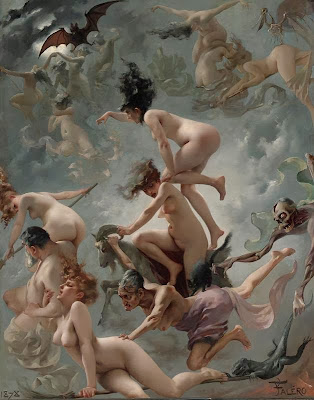
Departure of the Witches.

Luis Ricardo Faléro, Departure of the Witches, 1878, oil on canvas, 145.5 x 118.2 cm.

Luis Faléro is interesting on his own. Born in Spain in 1851, he was a precocious child. He studied in London when he was young and eventually settled there in 1887. But first, he ran away from a career in the Spanish Navy when he was only 16 years old. On foot. To Paris. Paying his way by doing crayon portraits. In Paris, he studied chemistry, engineering, and art, but abandoned the first two because they were too dangerous. Oh, and he also took up astronomy.

Some sources say Faléro was the Duke of Labranzano, but in any case, he was rich. With a pointed beard and black hair, he looked like he stepped out of a Velázquez painting. His compatriots called him Don Luis. In 1896, Maud Harvey sued him for paternity. She claimed that he seduced her when she was his 17-year-old housemaid and artist’s model. He fired her after he discovered she was pregnant. Although she was awarded 5 shillings per week, the suit may not have done her much good. Faléro died in December that same year.

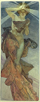
In reality, I don’t like much of Faléro’s art. He specialized in female nudes in allegorical settings. And while many of them are interesting as precursors to the work of art nouveau artist Alfons Mucha, they’re all incredibly syrupy. Like soft-focus Barbie dolls with no naughty-bits. He’s basically a more ethereal Bouguereau.

Right: William-Adolphe Bouguereau, Night, 1883, oil on canvas, 208.3 x 107.4 cm
Center: Luis Ricardo Faléro, Twin Stars, 1881, watercolor on paper, 41.9 x 21.6 cm.
Left: Alfons Mucha, Study for The Morning Star, 1902, ink and watercolor on paper, 56 x 21 cm.

But Departure of the Witches is different. It still has a pin-up girl aesthetic, but it also has grit, energy, and a little humor (did you see the skeleton’s mustache?!). And while the pattern-like groups of activity remind me of Dutch and Flemish art, Departure looks like it could have been painted yesterday. You know, by someone who really likes late 19th century academic art.

Right: Gil Elvgren, Riding High, 1958, oil on canvas, 76.2 x 61 cm.
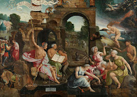
Left: Jacob Cornelisz van Oostsanen, Saul and the Witch of Endor, 1526, oil on panel, 85.5 x 122.8cm.

In reality, 
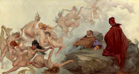
Departure of the Witches probably depicts a scene from the German legend of Faust in which a successful scholar makes a pact with the devil in exchange for unlimited knowledge and worldly pleasure. Johann Wolfgang von Goethe’s version of the legend was popular in theatres of the time, and Faléro is known to have painted at least one other depiction of the story. In fact, Sotheby’s mistakenly titled the painting Faust’s Vision in a 2003 auction and said that it had been exhibited in the Paris Salon of 1880. Oddly enough, the real Faust’s Vision was in the same auction mistakenly titled Faléro’s Dream.

Luis Ricardo Faléro, Faust’s Vision, 1880, oil on canvas, 81.2 x 150.5 cm.
 

Anyway, in Goethe’s play, the demon Mephistopheles represents the devil and leads Faust on a quest for ultimate bliss. With his help, Faust seduces Gretchen, a girl who becomes pregnant with his illegitimate child. To distract Faust from his situation, Mephistopheles gives him a dream of Walpurgis Night, a spring festival exactly 6 months before All Hallows' Eve when witches gather for their annual Sabbath in the German mountains. The dream lasts months, and Faust wakes to find that Gretchen has given birth, drowned the baby, and is sentenced to death.

So there you have it. Departure of the Witches depicts a fever dream of hellish debauchery. Maybe the lone man in the painting is Faust. Or maybe the painting hints at Faléro’s own scandalous future. Maybe the man is the artist himself.

Saturday, October 5, 2013

Monumental Attractions

I went to the movies last night, and guess what I saw. A preview for The Monuments Men! It comes out December 18, so if you haven’t read the book yet, you need to get going. It’s pretty lengthy!

Sunday, September 8, 2013

Tales of a Job Killer or: How I became a 27-Year-Old Intern

It's been a while since I've posted. But today I bring you something a little different. A spine tingling tale of desperation. A horror of towering magnitude.
Important Notice: It's only spine tingling and horrible when looked at on a large scale. On a small scale, I'm quite happy with my internship.

Here it goes:

I'm an intern again. I’m what’s wrong with the world. I, along with the countless others like me, am killing jobs, slashing wages, and obstructing a diversified workforce. Except I’m even worse than the others are. I’m 27. I’m done with school. I’m killing the dreams of the others too. Stealing internships away from those who actually need the college credit.

The sad kids whose internships I stole

“How did this happen,” you ask? How did I become the destroyer of worlds? Lets back up a bit.

I graduated with an undergraduate degree in painting and a minor in art history in 2008. You know, at the beginning of the “Great Recession.” I’d done an internship in a historical society the summer before going to college, another in an art museum the summer after, and some art related work-study jobs in between. But I was naïve and had no idea how competitive the job market would be. Looking back, my oversized cover letter and undersized resume never stood a chance.

Me, fresh out of college

So instead, I became a telemarketer. And when I couldn’t stand that anymore, I became a phone based customer service representative. It was hideous, and I hated it. But I know what you’re thinking. I’ve heard it a million times before. “You studied art.” “You should have researched your job prospects before choosing your major.” “You brought it on yourself.” And in a way, I did. I chose a field with precious few jobs. And the ones that do exist are low paid. But you know what? I’d do it again.

And I did. After a year of searching for an art job, I discovered that most positions I was applying for had one phrase in common: “Master’s degree preferred.” So I went back to school, completed two more internships, curated an exhibition, wrote a thesis, and earned my master’s degree in museum studies by 2012. Oh, and racked up lots of debt.

And all the while, I was unwittingly killing your job prospects and probably my own as well.

What I've done to the economy

The recession hit museums hard. Along with most industries. We're not special. But with hiring freezes and job cuts, the field still can’t support the number of newly minted masters being churned out each year. To make things worse, all these internships we’re clamoring for seem to be replacing entry-level work and driving down the salaries of the jobs that remain. Why buy the cow when you can get the milk free?

The result is more fully-qualified candidates cycling through a fixed number of part-time, temporary, and yes, even internship positions. It’s great for hiring managers, not so good for emerging professionals. Especially those emerging professionals who can’t afford to do the unpaid internships and volunteer work necessary to perhaps, one day, get a job. We’re excluding a whole facet of society and perpetuating the income gap.

So what do we do to fix the problem? Pass intern labor laws? Rise up and form intern unions? Somehow, we need to stop being so desperate for work that we forget that we’re professionals with valuable skills.

Job Seekers

But I’m not going to be the first one to do it. I’m grateful for my internship. I get to learn new things, do interesting work, and hopefully, eventually, use my vast internship experience to beat you all out for the ever-elusive “real job.” You know, the kind with money. The kind that a married 27-year-old is supposed to have by now.

All images courtesy of homestarrunner.com

Wednesday, July 3, 2013

Whistler's Whistlers

With the Fourth of July quickly approaching, there’s been about a million and a half firework displays here in upstate New York. I’ll admit I’ve only seen two or three of them personally, but it was enough to get me in a fireworks kind of mood. So today, I bring you the American expatriate James Abbott McNeill Whistler and his 1875 painting Nocturne in Black and Gold, the Falling Rocket.

James Abbott McNeill Whistler, Nocturne in Black and Gold, the Falling Rocket, 1875, oil on panel, 60.2 x 46.7 cm.

James Abbott Whistler (he added the McNeill later in honor of his mother’s maiden name) was born in Lowell, Massachusetts in July of 1834. He spent part of his childhood in Russia, but returned to the United States after his father died in 1849. He was a difficult kid and grew into a sarcastic, monocled dandy. But he was also an incredible painter and printmaker, and will forever be remembered for his iconic Arrangement in Grey and Black No. 1 (better known as Whistler’s Mother).

James Abbott McNeill Whistler, Arrangement in Grey and Black No. 1, 1871, oil on canvas, 144.3 x 162.5 cm.

Personally, I find the painting a bit boring.

Nocturne in Black and Gold, the Falling Rocket, on the other hand, is anything but boring. At first glance, it’s completely abstract. Tiny yellow and red specs pop against an undulating field of dark greenish blue. Then you see a few figures standing near the bottom of the canvas. A reflection hints at water, perhaps the white is a plume of smoke, and, you know, those specks kind of look like sparks. It’s ephemeral and ghostly, but a scene starts to emerge.

It turns out the scene is Cremorne Gardens on the River Thames. After four years immersed in the Parisian art scene, Whistler had settled in London just a few hundred yards from the notorious pleasure resort. The Gardens offered concerts, dancing, prostitution, and a nightly firework display that caught Whistler’s imagination not once, not twice, but at least three times!


Left: James Abbott McNeill Whistler, Nocturne in Blue and Gold, Old Battersea Bridge, 1872-5, oil on canvas, 68.3 x 51.2 cm.
Right: James Abbott McNeill Whistler, Nocturne in Black and Gold, the Fire Wheel, 1875, oil on canvas, 54.3 x 76.2 cm.

Whistler painted The Falling Rocket from memory. Like the Impressionists, he wanted to convey a fleeting moment. Unlike the impressionists, that moment was not real. It was an amalgamation. Like the image that pops into your head when you see the word “fireworks.” To capture the effects of darkness, Whistler abstracted and flattened his subject, making it look almost like the Japanese prints he found so fascinating.

Utagawa Hiroshige, Fireworks at Ryogoku, 1858, woodblock print, 36.2 x 23.5 cm.

The painting’s name emphasizes the abstraction. Like Kandinsky a generation or two later, Whistler used musical terms in his titles as a reference to the medium’s fundamentally abstract, but evocative, nature. A “nocturne” refers to a short, dreamy composition that suggests the night. The “in black and gold” part tells us that the ways the colors and forms interact is more important than the subject matter itself.

Vasily Kandinsky, Komposition V, 1911, oil on canvas, 190 x 275 cm.

Falling Rocket’s avant-garde abstraction also plays a leading role in an interesting story.  But this post is getting a bit long. So this is a “to be continued.” Go see some fireworks of your own!

Sunday, June 9, 2013

De Kooning's Death

Today I want to talk to you about another abstract expressionist painting: Reclining Man (John F. Kennedy) by Jackson Pollock’s friend, rival, and fellow Long Islander Willem de Kooning.

Willem de Kooning, Reclining Man (John F. Kennedy), 1963, oil on paper mounted on fiberboard, 58.4 x 68.6 cm.

Willem de Kooning was born in the Netherlands on April 14, 1904. He came to the United States in 1926, stowed away in the engine room of a British freighter. He eventually settled in New York where, along with Pollock, he became a leader of the abstract expressionist movement. He’s best known for his expressionist caricatures of women. With their huge eyes, pendulous boobs, and painted mouths, they look crude and vapid. But wonderfully done!

Willem de Kooning, Woman, I, 1950-52, oil on canvas, 192.7 x 147.3 cm.

That’s probably why I thought de Kooning's painting Reclining Man (John F. Kennedy) looked a bit vulgar at first. There’s that swirly mess of brushstrokes, the horizontal orientation, and the subdued color. It’s disturbing and somehow organic. And then there’s Kennedy’s exhausted expression, emerging from a sea of ambiguity. Growing up with Clone High and an endless stream of “Happy Birthday, Mr. President”s, I tend to think of Kennedy’s reputation as a ladies man first, with anything substantive coming second.

JFK according to Clone High

It turns out Reclining Man is exceptional in many ways. It’s horizontal, a recognizable portrait, a representation of a man, painted in soft colors, and the entirety of the composition is isolated in the center of the paper. All of these things are rare in de Kooning’s work. But what’s rarer is the real care and respect that went into the painting.

The man in Reclining Man wasn’t identified as Kennedy until the 1990s when the Hirshhorn Museum and Sculpture Garden organized an exhibition to celebrate de Kooning’s 90th birthday. Although de Kooning had been suffering from Alzheimer’s for years, the museum’s curator consulted his friends and colleagues to confirm the likeness. The painting wasn’t dated until 1998. Joseph Hirshhorn purchased the painting directly from de Kooning in 1964.  The photographer Hans Namuth took a series of photographs of the painting in de Kooning’s studio in 1963. The photographs show leafless trees outside the studio window. Why does that matter? Because that dates the painting to the fall or winter of 1963. Kennedy had been assassinated on November 22.

Reclining Man is de Kooning’s homage to a national tragedy, and I completely missed it. The unsettling feel I took for vulgarity is actually revulsion caused by death. Kennedy’s expression isn’t exhausted, it’s dazed, or hurt, or vacant. The chaotic explosion of brushstrokes mirrors the irreparable damage done to his body. In 2003, The New York Times described the painting as a depiction of a “bullet-ridden corpse.” In art history, men don’t lie down unless they’re dying.