Tuesday, November 12, 2013

Pyrex Plugged

As you may know, I’m an intern. I’m at the Corning Museum of Glass doing research for a 2015 exhibition celebrating the 100th anniversary of Pyrex. That’s right. The stuff in your kitchen cupboards. And that’s got me thinking. I’ve been really restricted in my posts so far. Nearly every work of art I’ve talked about is a painting. So I’m expanding my horizons. Instead of a “1 per artist,” I’m doing a “1 per brand.” Today I bring you the Pyrex Silver Streak iron.

Silver Streak Iron Insert (blue) and Silver Streak Electric Iron (red), United States, Corning, NY, Corning Glass Works; Saunders Machine and Tool Corporation, made in 1946; designed in 1943; Blue: H: 11.7 cm, W: 21.6 cm, D: 9.6 cm; Red: H: 12.5 cm, W: 22.7 cm, W: 9.8 cm (65.4.3, gift of Otto Hilbert; 2005.4.22).
Image courtesy of the Corning Museum of Glass.

Find out more about Pyrex and why I chose the Silver Streak at http://blog.cmog.org/2013/11/12/pyrex-on-the-home-front/. And remember, design is art too.

Sunday, October 27, 2013

Faléro's Foreshadowing

I like Halloween. It’s my favorite holiday. I find spooky things empowering and just plain fun. But what artist should I focus on for a Halloween themed post? Hieronymus Bosch intimidates me. My favorite Ensor doesn’t have a single skeleton or masked figure. I’ve already done Munch’s The Scream. Nothing seemed quite right. Until I came across Luis Ricardo Faléro’s 1878 oil painting Departure of the Witches.

Luis Ricardo Faléro, Departure of the Witches, 1878, oil on canvas, 145.5 x 118.2 cm.

Luis Faléro is interesting on his own. Born in Spain in 1851, he was a precocious child. He studied in London when he was young and eventually settled there in 1887. But first, he ran away from a career in the Spanish Navy when he was only 16 years old. On foot. To Paris. Paying his way by doing crayon portraits. In Paris, he studied chemistry, engineering, and art, but abandoned the first two because they were too dangerous. Oh, and he also took up astronomy.

Some sources say Faléro was the Duke of Labranzano, but in any case, he was rich. With a pointed beard and black hair, he looked like he stepped out of a Velázquez painting. His compatriots called him Don Luis. In 1896, Maud Harvey sued him for paternity. She claimed that he seduced her when she was his 17-year-old housemaid and artist’s model. He fired her after he discovered she was pregnant. Although she was awarded 5 shillings per week, the suit may not have done her much good. Faléro died in December that same year.

In reality, I don’t like much of Faléro’s art. He specialized in female nudes in allegorical settings. And while many of them are interesting as precursors to the work of art nouveau artist Alfons Mucha, they’re all incredibly syrupy. Like soft-focus Barbie dolls with no naughty-bits. He’s basically a more ethereal Bouguereau.

Right: William-Adolphe Bouguereau, Night, 1883, oil on canvas, 208.3 x 107.4 cm
Center: Luis Ricardo Faléro, Twin Stars, 1881, watercolor on paper, 41.9 x 21.6 cm.
Left: Alfons Mucha, Study for The Morning Star, 1902, ink and watercolor on paper, 56 x 21 cm.

But Departure of the Witches is different. It still has a pin-up girl aesthetic, but it also has grit, energy, and a little humor (did you see the skeleton’s mustache?!). And while the pattern-like groups of activity remind me of Dutch and Flemish art, Departure looks like it could have been painted yesterday. You know, by someone who really likes late 19th century academic art.

Right: Gil Elvgren, Riding High, 1958, oil on canvas, 76.2 x 61 cm.
Left: Jacob Cornelisz van Oostsanen, Saul and the Witch of Endor, 1526, oil on panel, 85.5 x 122.8cm.

In reality, Departure of the Witches probably depicts a scene from the German legend of Faust in which a successful scholar makes a pact with the devil in exchange for unlimited knowledge and worldly pleasure. Johann Wolfgang von Goethe’s version of the legend was popular in theatres of the time, and Faléro is known to have painted at least one other depiction of the story. In fact, Sotheby’s mistakenly titled the painting Faust’s Vision in a 2003 auction and said that it had been exhibited in the Paris Salon of 1880. Oddly enough, the real Faust’s Vision was in the same auction mistakenly titled Faléro’s Dream.

Luis Ricardo Faléro, Faust’s Vision, 1880, oil on canvas, 81.2 x 150.5 cm.
 

Anyway, in Goethe’s play, the demon Mephistopheles represents the devil and leads Faust on a quest for ultimate bliss. With his help, Faust seduces Gretchen, a girl who becomes pregnant with his illegitimate child. To distract Faust from his situation, Mephistopheles gives him a dream of Walpurgis Night, a spring festival exactly 6 months before All Hallows' Eve when witches gather for their annual Sabbath in the German mountains. The dream lasts months, and Faust wakes to find that Gretchen has given birth, drowned the baby, and is sentenced to death.

So there you have it. Departure of the Witches depicts a fever dream of hellish debauchery. Maybe the lone man in the painting is Faust. Or maybe the painting hints at Faléro’s own scandalous future. Maybe the man is the artist himself.

Saturday, October 5, 2013

Monumental Attractions

I went to the movies last night, and guess what I saw. A preview for The Monuments Men! It comes out December 18, so if you haven’t read the book yet, you need to get going. It’s pretty lengthy!

Sunday, September 8, 2013

Tales of a Job Killer or: How I became a 27-Year-Old Intern

It's been a while since I've posted. But today I bring you something a little different. A spine tingling tale of desperation. A horror of towering magnitude.
Important Notice: It's only spine tingling and horrible when looked at on a large scale. On a small scale, I'm quite happy with my internship.

Here it goes:

I'm an intern again. I’m what’s wrong with the world. I, along with the countless others like me, am killing jobs, slashing wages, and obstructing a diversified workforce. Except I’m even worse than the others are. I’m 27. I’m done with school. I’m killing the dreams of the others too. Stealing internships away from those who actually need the college credit.

The sad kids whose internships I stole

“How did this happen,” you ask? How did I become the destroyer of worlds? Lets back up a bit.

I graduated with an undergraduate degree in painting and a minor in art history in 2008. You know, at the beginning of the “Great Recession.” I’d done an internship in a historical society the summer before going to college, another in an art museum the summer after, and some art related work-study jobs in between. But I was naïve and had no idea how competitive the job market would be. Looking back, my oversized cover letter and undersized resume never stood a chance.

Me, fresh out of college

So instead, I became a telemarketer. And when I couldn’t stand that anymore, I became a phone based customer service representative. It was hideous, and I hated it. But I know what you’re thinking. I’ve heard it a million times before. “You studied art.” “You should have researched your job prospects before choosing your major.” “You brought it on yourself.” And in a way, I did. I chose a field with precious few jobs. And the ones that do exist are low paid. But you know what? I’d do it again.

And I did. After a year of searching for an art job, I discovered that most positions I was applying for had one phrase in common: “Master’s degree preferred.” So I went back to school, completed two more internships, curated an exhibition, wrote a thesis, and earned my master’s degree in museum studies by 2012. Oh, and racked up lots of debt.

And all the while, I was unwittingly killing your job prospects and probably my own as well.

What I've done to the economy

The recession hit museums hard. Along with most industries. We're not special. But with hiring freezes and job cuts, the field still can’t support the number of newly minted masters being churned out each year. To make things worse, all these internships we’re clamoring for seem to be replacing entry-level work and driving down the salaries of the jobs that remain. Why buy the cow when you can get the milk free?

The result is more fully-qualified candidates cycling through a fixed number of part-time, temporary, and yes, even internship positions. It’s great for hiring managers, not so good for emerging professionals. Especially those emerging professionals who can’t afford to do the unpaid internships and volunteer work necessary to perhaps, one day, get a job. We’re excluding a whole facet of society and perpetuating the income gap.

So what do we do to fix the problem? Pass intern labor laws? Rise up and form intern unions? Somehow, we need to stop being so desperate for work that we forget that we’re professionals with valuable skills.

Job Seekers

But I’m not going to be the first one to do it. I’m grateful for my internship. I get to learn new things, do interesting work, and hopefully, eventually, use my vast internship experience to beat you all out for the ever-elusive “real job.” You know, the kind with money. The kind that a married 27-year-old is supposed to have by now.

All images courtesy of homestarrunner.com

Wednesday, July 3, 2013

Whistler's Whistlers

With the Fourth of July quickly approaching, there’s been about a million and a half firework displays here in upstate New York. I’ll admit I’ve only seen two or three of them personally, but it was enough to get me in a fireworks kind of mood. So today, I bring you the American expatriate James Abbott McNeill Whistler and his 1875 painting Nocturne in Black and Gold, the Falling Rocket.

James Abbott McNeill Whistler, Nocturne in Black and Gold, the Falling Rocket, 1875, oil on panel, 60.2 x 46.7 cm.

James Abbott Whistler (he added the McNeill later in honor of his mother’s maiden name) was born in Lowell, Massachusetts in July of 1834. He spent part of his childhood in Russia, but returned to the United States after his father died in 1849. He was a difficult kid and grew into a sarcastic, monocled dandy. But he was also an incredible painter and printmaker, and will forever be remembered for his iconic Arrangement in Grey and Black No. 1 (better known as Whistler’s Mother).

James Abbott McNeill Whistler, Arrangement in Grey and Black No. 1, 1871, oil on canvas, 144.3 x 162.5 cm.

Personally, I find the painting a bit boring.

Nocturne in Black and Gold, the Falling Rocket, on the other hand, is anything but boring. At first glance, it’s completely abstract. Tiny yellow and red specs pop against an undulating field of dark greenish blue. Then you see a few figures standing near the bottom of the canvas. A reflection hints at water, perhaps the white is a plume of smoke, and, you know, those specks kind of look like sparks. It’s ephemeral and ghostly, but a scene starts to emerge.

It turns out the scene is Cremorne Gardens on the River Thames. After four years immersed in the Parisian art scene, Whistler had settled in London just a few hundred yards from the notorious pleasure resort. The Gardens offered concerts, dancing, prostitution, and a nightly firework display that caught Whistler’s imagination not once, not twice, but at least three times!


Left: James Abbott McNeill Whistler, Nocturne in Blue and Gold, Old Battersea Bridge, 1872-5, oil on canvas, 68.3 x 51.2 cm.
Right: James Abbott McNeill Whistler, Nocturne in Black and Gold, the Fire Wheel, 1875, oil on canvas, 54.3 x 76.2 cm.

Whistler painted The Falling Rocket from memory. Like the Impressionists, he wanted to convey a fleeting moment. Unlike the impressionists, that moment was not real. It was an amalgamation. Like the image that pops into your head when you see the word “fireworks.” To capture the effects of darkness, Whistler abstracted and flattened his subject, making it look almost like the Japanese prints he found so fascinating.

Utagawa Hiroshige, Fireworks at Ryogoku, 1858, woodblock print, 36.2 x 23.5 cm.

The painting’s name emphasizes the abstraction. Like Kandinsky a generation or two later, Whistler used musical terms in his titles as a reference to the medium’s fundamentally abstract, but evocative, nature. A “nocturne” refers to a short, dreamy composition that suggests the night. The “in black and gold” part tells us that the ways the colors and forms interact is more important than the subject matter itself.

Vasily Kandinsky, Komposition V, 1911, oil on canvas, 190 x 275 cm.

Falling Rocket’s avant-garde abstraction also plays a leading role in an interesting story.  But this post is getting a bit long. So this is a “to be continued.” Go see some fireworks of your own!

Sunday, June 9, 2013

De Kooning's Death

Today I want to talk to you about another abstract expressionist painting: Reclining Man (John F. Kennedy) by Jackson Pollock’s friend, rival, and fellow Long Islander Willem de Kooning.

Willem de Kooning, Reclining Man (John F. Kennedy), 1963, oil on paper mounted on fiberboard, 58.4 x 68.6 cm.

Willem de Kooning was born in the Netherlands on April 14, 1904. He came to the United States in 1926, stowed away in the engine room of a British freighter. He eventually settled in New York where, along with Pollock, he became a leader of the abstract expressionist movement. He’s best known for his expressionist caricatures of women. With their huge eyes, pendulous boobs, and painted mouths, they look crude and vapid. But wonderfully done!

Willem de Kooning, Woman, I, 1950-52, oil on canvas, 192.7 x 147.3 cm.

That’s probably why I thought de Kooning's painting Reclining Man (John F. Kennedy) looked a bit vulgar at first. There’s that swirly mess of brushstrokes, the horizontal orientation, and the subdued color. It’s disturbing and somehow organic. And then there’s Kennedy’s exhausted expression, emerging from a sea of ambiguity. Growing up with Clone High and an endless stream of “Happy Birthday, Mr. President”s, I tend to think of Kennedy’s reputation as a ladies man first, with anything substantive coming second.

JFK according to Clone High

It turns out Reclining Man is exceptional in many ways. It’s horizontal, a recognizable portrait, a representation of a man, painted in soft colors, and the entirety of the composition is isolated in the center of the paper. All of these things are rare in de Kooning’s work. But what’s rarer is the real care and respect that went into the painting.

The man in Reclining Man wasn’t identified as Kennedy until the 1990s when the Hirshhorn Museum and Sculpture Garden organized an exhibition to celebrate de Kooning’s 90th birthday. Although de Kooning had been suffering from Alzheimer’s for years, the museum’s curator consulted his friends and colleagues to confirm the likeness. The painting wasn’t dated until 1998. Joseph Hirshhorn purchased the painting directly from de Kooning in 1964.  The photographer Hans Namuth took a series of photographs of the painting in de Kooning’s studio in 1963. The photographs show leafless trees outside the studio window. Why does that matter? Because that dates the painting to the fall or winter of 1963. Kennedy had been assassinated on November 22.

Reclining Man is de Kooning’s homage to a national tragedy, and I completely missed it. The unsettling feel I took for vulgarity is actually revulsion caused by death. Kennedy’s expression isn’t exhausted, it’s dazed, or hurt, or vacant. The chaotic explosion of brushstrokes mirrors the irreparable damage done to his body. In 2003, The New York Times described the painting as a depiction of a “bullet-ridden corpse.” In art history, men don’t lie down unless they’re dying.

Tuesday, May 21, 2013

Currin Events

Speaking of John Currin and auctions. Did you know that a 1991 painting he did of actress Bea Arthur’s boobs sold for $1.9 million this past week? Bea Arthur Naked was part of Christie’s Post-War and Contemporary Art auction last Wednesday. It was purchased by an anonymous bidder.

Bea Arthur Naked (along with its contemporaries) was controversial from the start. Critics called Currin a misogynist and urged readers to boycott his 1992 show at New York’s Andrea Rosen Gallery. Even Currin’s own words seem jarring. He described the sexualized older women he depicted as “between the object of desire and the object of loathing.”

But to me, Bea Arthur Naked looks more dignified than a lot of Currin’s work. It’s almost reverent. Bea smirks at us. She looks confident, as if daring us to take a peek at her “golden girls.” It’s no Thanksgiving, but it has the feel of a middle-aged Olympia. And it’s definitely fun.

Edouard Manet, Olympia, 1863, oil on canvas, 130 x 190 cm.

So without further ado, I give you John Currin’s Bea Arthur Naked. Be warned! The photo got people temporarily booted from Facebook.

John Currin, Bea Arthur Naked, 1991, oil on canvas, 97.1 x 81.2 cm.

Monday, May 13, 2013

Pollock's Unconscious

It’s been a busy couple of months. I went to Boston to help promote my husband’s nerdy board game, set up a lecture series (see "The Blue and the Grey"), celebrated a birthday, and had seven interviews. And while the majority of the interviews were phone or internet based, I traveled over 2,000 miles for one of them. It took a whole day to fly there, two nights in a hotel, and a whole day to fly back. And the museum paid for it all! So although I didn’t get the job, today I honor Cody, Wyoming: a vibrant little town outside Yellowstone National Park and the birthplace of legendary abstract expressionist painter Jackson Pollock.

Cody, Wyoming seen from the Whitney Gallery of Western Art at the Buffalo Bill Historical Center in 2009.
Buffalo Bill Historical Center photo by Chris Gimmeson.

Jackson Pollock grew up in the West. He was born in Cody in 1912 and lived in Arizona and California before moving to New York City with his brother Charles. The pair studied under famed regionalist painter Thomas Hart Benton, but Jackson soon began to experiment with abstraction. In 1947, he completed the first of the action paintings that would define his mature style. In 1956, Time magazine dubbed him “Jack the Dripper.” Thanks to his groundbreaking poured, dribbled, and splattered works, Pollock became the first American recognized as a modern master abroad. He helped shift the heart of the art world from Paris to New York.

Jackson Pollock, Number 1A, 1948, 1948, oil and enamel paint on canvas, 172.7. x 264.2 cm.

I didn’t choose one of those paintings though. I chose The Blue Unconscious, a monumental work completed in the summer of 1946, right on the cusp of Pollock’s notorious “drip” period.

Jackson Pollock, The Blue Unconscious, 1946, oil on canvas, 213.4 x 142.1 cm.

The Blue Unconscious is the largest of seven paintings in Pollock’s “Sounds in the Grass” series. Based on the environment of his new Long Island home, it’s painted in an “all-over” style that suggests wide ocean vistas, expansive marshland, and the spacious Western skies of his childhood (the blue in The Blue Unconscious?). But Pollock seems to have focused more on the life than on the landscape. Mixing imagery and abstraction, he suggests a microcosm of dogs, insects, birds, plant life, and sea creatures. I think I can even make out a face or two. It reminds me of the animated energy of Keith Haring, but more obscured.

Keith Haring, Stones 5, 1989, lithograph, 76 x 56.5cm.

And that’s where the unconscious in The Blue Unconscious comes in. European art movements like surrealism, cubism, and fauvism inspired Pollock. “I am particularly impressed,” he stated of the newly emigrated artists living in New York, “with their concept of the source of art being the unconscious.” So he internalized and universalized his subject matter. And although the imagery may look garbled, his work reflects the spirit of nature better than any single representational image can. The Blue Unconscious looks like Picasso's cubism painted in the colors of Matisse.

Right: Pablo Picasso, Guernica, 1937, oil on canvas, 349 x 776 cm.
Left: Henri Matisse, Femme au chapeau (Woman with a Hat),1905, oil on canvas, 80.65 x 59.69 cm.

Until last year, you could have seen The Blue Unconscious at Houston’s Museum of Fine Art where it had been on loan since 2007. But tomorrow, the painting will be auctioned off in New York as part of Sotheby’s Contemporary Art Evening Auction (Seriously, Sotheby’s? You call a 67-year-old painting contemporary?!). Just six months after the auction house set a Pollock record with Number 4, 1951, The Blue Unconscious is estimated to bring in $20 to $30 million. So ready your unlimited financial reserves! It promises to be a rousing event! And if The Blue Unconscious is too rich for your blood, maybe you could pick up John Currin’s Lydian or, my personal favorite, Dan Colen’s 53rd & 3rd.

Right: John Currin, Lydian, 2013, oil on canvas, 71.1 x 50.8 cm.
Left: Dan Colen, 53rd & 3rd, 2008, chewing gum and paper on canvas, 152.4 x 240 cm.

Tuesday, April 30, 2013

The Blue and the Grey

I've been neglecting my blog in part to write for a blog at work. Check it out here. It's about a Civil War lecture series I've been planning.  If you're in the area, you should stop by the Chemung Valley History Museum every Thursday evening in May!  We'll have snacks!

Saturday, April 6, 2013

Denis's Anemones

It finally feels like spring! The snow’s melted, flowers are beginning to poke up here and there, and I saw a whole flock of robins while I was out walking in the park. So to get you in the spring mood, today I bring you Maurice Denis and his 1891 oil painting April, Anemones.

Maurice Denis, April, Anemones, 1891, oil on canvas, 65 x 78 cm.

Maurice Denis was a French painter and a member of the avant-garde brotherhood known as Les Nabis. Translating to “The Prophets” in Hebrew, the Nabis began as a group of rebellious art students seeking to create a new form of expression. And they succeeded. Taking up the mantle of the Post-Impressionists (particularly Gauguin), the Nabis paved the way for Fauvism, Cubism, Modernism . . . . A huge chunk of the art we see today. But the Nabis also had a lot of weird mystical stuff going on. They referred to themselves as initiates, basically created their own secret language, and named their defining painting The Talisman.

Paul Sérusier, The Talisman, 1888, oil on wood, 27 x 21 cm.

Denis was the Nabis’ theoretician. Pointing out art’s fundamental abstraction, he reminded us that “a picture, before being a battle horse, a nude, an anecdote or whatnot, is essentially a flat surface covered with colors assembled in a certain order.” He was also incredibly Catholic, so the spiritualism suited him.

Spring was a recurring theme for Denis.  In fact, April, Anemones isn't even the only “April” painting Denis did. Shortly after completing our April, Denis did a series of paintings to decorate a girl’s bedroom based on the months of the year. There was September, October, July, and April. And the April in this series is incredibly similar to our April. Young women pick white flowers along a meandering path. There’s even the same straggly bush in the bottom left.

Maurice Denis, April, 1882, oil on canvas, 61 x 37.5 cm.

But there are differences. And the most important one is style. Both Aprils are simplified and abstracted, but April, Anemones reflects the pointillism of Seurat while the April (picture for a girl's room) is an example of cloisonnism, a technique perfected by Gauguin where areas of bold, flat color are separated by dark contours (the term cloisonnism comes from cloisonné, a metalworking technique where wire compartments, or cloisons in French, are filled with glass, enamel, or gemstone inlays). I went back and forth trying to choose between dots and outlines. There are some fantastic outline works, but in the end, dots won.

Right: Georges Seurat, Grey Weather, Grande Jatte, 1888, oil on canvas, 70.5 x 86.4 cm.
Left: Paul Gauguin, The Yellow Christ, 1889, oil on canvas, 92.1 x 73.3 cm.

When I first came across an image of April, Anemones, it was mislabeled Easter Morning. I pictured the two kneeling women hiding eggs for an impending Easter egg hunt. As you can imagine, that’s not what’s going on. One source says that the woman in white is newly engaged and that the winding path is leading her toward a new life stage. It points to the couple in the background and says that that’s what she has to look forward to: happy days strolling through the woods with her husband. And the model for the woman is Denis’s future wife Marthe Meurier, so that could be true.

I get something else out of the painting though. I still think it could be a young woman progressing through life, but in the midst of all the spring loveliness, I get a bit of a melancholy vibe. The couple in the background is dressed in black. They look like they’re in mourning. Like someone died. Maybe the girl herself. Maybe Denis was pointing out that even in the spring of life, death is lurking just out of view.

Friday, March 22, 2013

New Recommended Reading!

I’ve added a new book to the recommended reading page!


But there’s a deadline for this one. Robert Edsel’s non-fiction book The Monuments Men: Allied Heroes, Nazi Thieves, and the Greatest Treasure Hunt in History is being made into a George Clooney movie. It’s scheduled to be released December 18 of this year, so get reading! You’ll want to know all about World War II’s Monuments, Fine Arts, and Archives (MFAA) program and the men and women who risked their lives to save the world’s art, architecture, and culture. You know, so you can cosplay as your favorite character at the midnight showing.

Sunday, March 17, 2013

Leech's Lilies

It’s Saint Patrick’s Day, and that got me thinking. I don’t know a single Irish artist. Francis Bacon maybe? He was born in Dublin, but his parents were British, and art historians typically consider him British. While Bacon still may count, I knew there must be more Irish artists out there. So I scoured the internet. My search naturally led me to the National Gallery of Ireland and last year’s “Ireland’s Favourite Painting” competition. Competitors included Jack B. Yeats, John Lavery, Sean Scully, Harry Clarke, and the eventual winner Frederic William Burton.

But the artist I fell in love with was William John Leech (I probably would have picked Harry Clarke, but he’s a prolific illustrator and stained glass artist, and the magnitude of his oeuvre overwhelmed me).

William John Leech, A Convent Garden, Brittany, 1913, oil on canvas, 132 x 106 cm.

William Leech was born in Dublin in 1881. He studied under Walter Osborn (yet another Irish artist!), but didn’t actually do much work in Ireland. He went to France, painted in Brittany, and eventually settled in England. I’m mostly interested in his work in Brittany. Or the work he made around that time at least. It’s bright, and thick, and juicy. A wonderful mix of the impressionism of van Gogh and the finish of John Singer Sargent. Any earlier and his paintings are a bit too dark and traditional. I’m not really sure why I don’t like his later stuff as much though. It just doesn’t have the same draw.

Right: Vincent van Gogh, Undergrowth with Two Figures, 1890, oil on canvas, 49.5 x 99.7 cm
Left: John Singer Sargent, Carnation, Lily, Lily, Rose, 1886, oil on canvas, 174 x 153.7 cm.

On to the painting I chose. A Convent Garden, Brittany is set in Concarneau at a hospital run by the Sisters of the Holy Ghost. Leech was there in 1904 while recovering from typhoid fever. In 1911, he painted The Secret Garden from drawings he made at the time. His leafy lilies are painted with vivid energy and life, but at the same time, the brushstrokes seem to break down into pattern.

William John Leech, The Secret Garden, 1911, oil on canvas, 112 x 86.5 cm.

Convent Garden is basically Secret Garden with nuns. Plant life frames and partially obscures a novice holding a prayer book. She’s dressed in a traditional Breton wedding dress, a custom marking the day a novice takes her final vows. Her little clearing is bathed in light, but it’s surrounded by shade. A group of older nuns seems to be walking away in the background. The whole scene makes me feel like I’m eavesdropping, hiding in the lilies. The energy of the plants contrasts with the stillness of the novice and creates a sense of tension. It’s as if you’re witnessing this pivotal, highly private moment in time. The painting pulls you in, yet keeps you at a distance.

The model for the novice is Leech’s first wife Elizabeth Saurine Kerlin. When the couple first met, Elizabeth was married to another man, but by 1912, she had gotten a divorce, leaving her free to marry Leech. When we consider this new information, Convent Garden becomes a wedding portrait. A young bride surrounded by beautiful white lilies, symbols for purity and promise.

Wednesday, February 27, 2013

Bush's Bathroom

Last week was President’s Day, and I’m celebrating by bringing you the paintings of former United States president George W. Bush. “Aren’t you a bit late?” you may ask. Yes, a bit. Bush’s new hobby has been all over TV, in the latest issue of The Week, and even favorably reviewed by everyone’s favorite art critic Jerry Saltz. And it’s also not President’s Day anymore. But I came across a website counting down the seconds until the meaning behind the art of Gorge W. Bush is revealed. Right now, it’s at 00 weeks 02 days 16 hours 47 minutes and 32 seconds. So there you go. There’s still time before the story really breaks.

George W. Bush, the Artist

If you haven’t already heard about Bush’s art, here’s the situation. On October 14, New York Magazine reported that our 43rd president had “taken up painting, making portraits of dogs and arid Texas landscapes.” On February 1, we got to see one of these dog paintings first hand on Laura and George’s respective Facebook pages. It was a portrait of the Bushs’ late Scottish Terrier Barney, and it was surprisingly good. Although it’s a bit hard to figure out where the fur ends and a black dog sweater begins, Bush handles Barney’s fur, ears, and eye like a pro. Or at least like an art school freshman experimenting with impressionistic doggy portraiture.

Bush apparently signs his work "43"

Anyway, on to the scandalous part. Early this month some dude (chick?) calling him(her?)self Guccifer hacked into a Bush family computer. It wasn’t all fun and games. He (she?) got security codes, addresses, phone numbers, and incredibly personal information. Including a horrible photo of Bush Senior in the hospital and plans for his funeral. It was bad. The FBI has launched a criminal investigation.

But what we’re interested in is not Bush 41’s health scare or clandestine information. It’s the art. There was a photo of Bush painting a picture of St. Ann’s Episcopal Church in Kennebunkport, Maine, but we’re going to ignore this painting too. It’s tiny, hard to see, and boring. Although it is interesting to note that Bush paints in the midst of exercise equipment.

He looks like he’s about to play tennis

No, Guccifer found the true treasures in an email from Bush to his sister Dorothy. They appear to be self-portraits. Naked. In a bathroom.


The first shows our former president standing in the shower, his back to us. It’s not sophisticated. In fact, it’s awkward and naive. Bush isn’t under the water. He’s facing the wrong direction, standing so close to the wall he looks like a toddler in time-out. And the apparent reflection of his face in the mirror just below the shower head is totally impossible. Not to mention those back muscles.

But the painting does have something going for it. For one, I sort of like the angle and shadows created by the glass of the shower door (see the hinge in the top left?). Beyond that though, it has an interesting emotional impact. It’s unnervingly bizarre, and yet so mundane and thoughtful that we actually start to empathize with Bush. It’s like he’s a real human being, taking showers just like the rest of us.

The second painting has all the emotion of the first, but with the added bonus of showing some formal artistic potential (I chose this one!). The knees could use a little work, but I really like the toes and hint of leg beneath the water. But mostly I like the depth. The angles of the walls and the tub, although off, really lead you into the painting. And did you see the faucet? While it looks more like a sink faucet than one on a bathtub, the tuned handle, the contrast of light and shadow, and even the stream of water are actually pretty good. Plus, I always love art made from the perspective of the subject. It’s like you’re inside the painting.

Everyone’s been trying to psychoanalyze these paintings, making connections to Hurricane Katrina, waterboarding, and even gay marriage (they assumed the reflection in the shower painting was of some other dude standing behind Bush). But Bush is just one more painting politician in the company of Dwight D. Eisenhower, Winston Churchill, and Hitler. And in the end, I’m not sure I should be the one to judge him. I can’t remember what I was thinking, but even I once made a naked shower painting.

Can you tell which politician did which painting?
 

Saturday, February 16, 2013

Ch-ch-changes

It's not often that I get the chance to post about one of my choices being reworked. I guess that comes with the "living artist" territory.

Anyway, after deinstalling her Eastern State Penitentiary windows, Judith Schaechter added borders and expanded compositions. For the Con/Fines windows (including my favorite, Mary Magdalene), she created thick, stone-like stained glass frames that make the original centers seem cramped and isolated, but in a good way. While the context of Eastern State really made these pieces, and I think I may have preferred their unaltered state, I get that they needed a little something to highlight their fundamental concept and make them stand-alone works.

What do you think!?

To see the changes Schaechter made to her Eastern State Penitentiary windows, read her blog at judithschaechterglass.blogspot.com

Sunday, February 10, 2013

Munch's Madness

A couple of weeks ago, I went to New York City to see three exhibitions: The Art of Scent at the Museum of Art and Design, and Inventing Abstraction and The Scream at the Museum of Modern Art. So today, I figured I’d talk about my favorite Munch. Surprise, surprise, it’s The Scream. Just not exactly the Scream that I saw.

The Scream I saw                               vs.                               The Scream I chose

We all know The Scream. It’s iconic. Andy Warhol did a series of silkscreens reproducing it along with other Munch works, The Simpsons parodied it, and the ubiquitous scream mask featured in the Scream movies and sold in just about every store around Halloween is based on it. They even sell screaming Scream pillows on the internet (I have one). And now, until April 29, you can see 
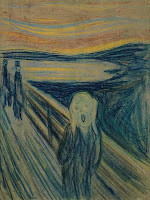
The Scream at MoMA up close and personal (ignoring the plexiglas barrier and the throngs of people).

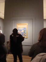
What you'll see at MoMA

But one thing most of us don’t know is that there are four versions of The Scream. And that’s not counting the lithograph or the Munch works that have eerily similar subjects or compositions. The four works I’m talking about are so similar that, except for differences in media, they’re nearly identical. The version at MoMA is Munch’s pastel Scream from 1895. But like I said, that one’s not my favorite. My favorite is the 1893 tempera and crayon version. I’ll tell you why and talk about all of the versions a little later. First, I want to cover what they have in common.

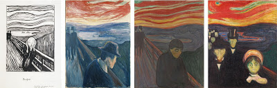
The Scream lithograph and other similar Munch works (Despair 1892, Despair 1894, and Anxiety)

The Scream (the hypothetical conglomerate of all the versions) was originally titled Der Schrei der Natur, or The Scream of Nature, and is one (four) of the most emotionally powerful works of art out there. It’s set in Ekeburg, Norway looking out onto the Oslofjord and the cityscape of Oslo, and, if we take Munch’s diary entries at face value, it’s based on an actual experience.

I was walking along the road with two friends. The sun set. I felt a tinge of melancholy. Suddenly the sky became a bloody red. I stopped, leaned against the railing, dead tired. And I looked at the flaming clouds that hung like blood and a sword over the blue-black fjord and city. My friends walked on. I stood there, trembling with fright. And I felt a loud, unending scream piercing nature.

But that’s where the resemblance to the real world stops and distortion begins. Some art historians think that Munch may have based The Scream’s sky on vibrant ash-induced sunsets after the Krakatau eruption in 1883 and the central figure on a mummy he may have seen. But I think that’s all silly speculation and doesn’t really matter one way or the other. Munch was a symbolist master and a precursor of the expressionist movement. He was using distorted, simplified forms, shallow, stage-like compositions, and “arbitrary” color (like van Gogh) to convey an emotional experience. He wasn’t going for realism. He painted a pasty, hairless, skull-faced man with no spine wearing a shapeless robe for God’s sake!

And Munch had plenty of emotion to work from. In addition to the typical fin de siècle anxieties, his mother and sister died when he was young, his father was a weirdo, and Munch himself was prone to excessive drunken “brawling.” Not far from the setting of The Scream, there was also a mental institution where another sister was locked up and a slaughterhouse that was said to be pretty hellish. Oh, and apparently the area was fairly popular for suicide.

The little known fact that The Scream was originally conceived as part of Munch’s Frieze of Life series shows just how mucked up Munch’s perceptions were. The series was made up of themes of love, angst, and death. The Scream was the culminating work in love. Munch believed that the ultimate outcome of love was despair.

Now back to the different versions. Munch supposedly made multiples because he found it hard to part with his work. We don’t know which one came first. It was either my favorite (the tempera and crayon version) or the Munch Museum’s crayon only Scream. Both were done in 1893. I’m going to guess that it might have been the crayon only one though, since it’s rougher and more washed out. Like a preliminary sketch. But I’m probably wrong.

Edvard Munch, The Scream, 1893, crayon on cardboard, 74 x 56 cm.

My favorite Scream is in Norway’s National Gallery, so I probably won’t be able to see it in person any time soon. But I managed to get my hands on a relatively large digital image, and just that takes my breath away. As a whole, the National Gallery’s version is the most put together. When you look close though, you can see how a mess of separate brushstrokes, washes, and lines work together to create the whole. I love how casual and irreverent each mark is. Even the white spatters in the lower right corner that look like bird poop are fantastic. I also think the figures in the background of this version are the best. Their tall, upright bodies and nearly invisible heads make them seem ghostly and mysterious.

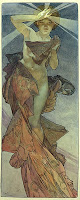
The Scream currently at MoMA came two years later. It’s the most colorful, but it’s a bit too crisp for me. The comparatively sharp lines and the virtual rainbow of color make it seem somewhat cartoony. It does have a unique hand painted frame going for it though. It’s the only original frame left, and Munch wrote a poem on it describing his experience in Ekeburg!

The last Scream is also in the Munch Museum in Oslo and was done in tempera in 1910. Like the crayon version, it seems a bit rough. But it works. The flowing lines (look at those hands!) and the vacant, eyeless face makes it the most emotionally expressive of the bunch.

Edvard Munch, The Scream, 1910, tempra on cardboard, 83.5 x 66 cm.

In the end, it’s hard to distinguish quality and admiration from familiarity. I know I like The Scream, but if I hadn’t grown up with it would I have chosen it as my favorite? I can’t tell. But I will say one thing: On the other side of the wall The Scream is hung on at MoMA is Munch’s Madonna. I was surprised how drawn to it I was, and since everyone was crowded around The Scream, I got it all to myself.

 But I think I may like this 1894 painted version better than MoMA's lithograph and woodcut.