Sunday, September 8, 2013

Tales of a Job Killer or: How I became a 27-Year-Old Intern

It's been a while since I've posted. But today I bring you something a little different. A spine tingling tale of desperation. A horror of towering magnitude.
Important Notice: It's only spine tingling and horrible when looked at on a large scale. On a small scale, I'm quite happy with my internship.

Here it goes:

I'm an intern again. I’m what’s wrong with the world. I, along with the countless others like me, am killing jobs, slashing wages, and obstructing a diversified workforce. Except I’m even worse than the others are. I’m 27. I’m done with school. I’m killing the dreams of the others too. Stealing internships away from those who actually need the college credit.

The sad kids whose internships I stole

“How did this happen,” you ask? How did I become the destroyer of worlds? Lets back up a bit.

I graduated with an undergraduate degree in painting and a minor in art history in 2008. You know, at the beginning of the “Great Recession.” I’d done an internship in a historical society the summer before going to college, another in an art museum the summer after, and some art related work-study jobs in between. But I was naïve and had no idea how competitive the job market would be. Looking back, my oversized cover letter and undersized resume never stood a chance.

Me, fresh out of college

So instead, I became a telemarketer. And when I couldn’t stand that anymore, I became a phone based customer service representative. It was hideous, and I hated it. But I know what you’re thinking. I’ve heard it a million times before. “You studied art.” “You should have researched your job prospects before choosing your major.” “You brought it on yourself.” And in a way, I did. I chose a field with precious few jobs. And the ones that do exist are low paid. But you know what? I’d do it again.

And I did. After a year of searching for an art job, I discovered that most positions I was applying for had one phrase in common: “Master’s degree preferred.” So I went back to school, completed two more internships, curated an exhibition, wrote a thesis, and earned my master’s degree in museum studies by 2012. Oh, and racked up lots of debt.

And all the while, I was unwittingly killing your job prospects and probably my own as well.

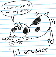
What I've done to the economy

The recession hit museums hard. Along with most industries. We're not special. But with hiring freezes and job cuts, the field still can’t support the number of newly minted masters being churned out each year. To make things worse, all these internships we’re clamoring for seem to be replacing entry-level work and driving down the salaries of the jobs that remain. Why buy the cow when you can get the milk free?

The result is more fully-qualified candidates cycling through a fixed number of part-time, temporary, and yes, even internship positions. It’s great for hiring managers, not so good for emerging professionals. Especially those emerging professionals who can’t afford to do the unpaid internships and volunteer work necessary to perhaps, one day, get a job. We’re excluding a whole facet of society and perpetuating the income gap.

So what do we do to fix the problem? Pass intern labor laws? Rise up and form intern unions? Somehow, we need to stop being so desperate for work that we forget that we’re professionals with valuable skills.

Job Seekers

But I’m not going to be the first one to do it. I’m grateful for my internship. I get to learn new things, do interesting work, and hopefully, eventually, use my vast internship experience to beat you all out for the ever-elusive “real job.” You know, the kind with money. The kind that a married 27-year-old is supposed to have by now.

All images courtesy of homestarrunner.com

Wednesday, July 3, 2013

Whistler's Whistlers

With the Fourth of July quickly approaching, there’s been about a million and a half firework displays here in upstate New York. I’ll admit I’ve only seen two or three of them personally, but it was enough to get me in a fireworks kind of mood. So today, I bring you the American expatriate James Abbott McNeill Whistler and his 1875 painting Nocturne in Black and Gold, the Falling Rocket.

James Abbott McNeill Whistler, Nocturne in Black and Gold, the Falling Rocket, 1875, oil on panel, 60.2 x 46.7 cm.

James Abbott Whistler (he added the McNeill later in honor of his mother’s maiden name) was born in Lowell, Massachusetts in July of 1834. He spent part of his childhood in Russia, but returned to the United States after his father died in 1849. He was a difficult kid and grew into a sarcastic, monocled dandy. But he was also an incredible painter and printmaker, and will forever be remembered for his iconic Arrangement in Grey and Black No. 1 (better known as Whistler’s Mother).

James Abbott McNeill Whistler, Arrangement in Grey and Black No. 1, 1871, oil on canvas, 144.3 x 162.5 cm.

Personally, I find the painting a bit boring.

Nocturne in Black and Gold, the Falling Rocket, on the other hand, is anything but boring. At first glance, it’s completely abstract. Tiny yellow and red specs pop against an undulating field of dark greenish blue. Then you see a few figures standing near the bottom of the canvas. A reflection hints at water, perhaps the white is a plume of smoke, and, you know, those specks kind of look like sparks. It’s ephemeral and ghostly, but a scene starts to emerge.

It turns out the scene is Cremorne Gardens on the River Thames. After four years immersed in the Parisian art scene, Whistler had settled in London just a few hundred yards from the notorious pleasure resort. The Gardens offered concerts, dancing, prostitution, and a nightly firework display that caught Whistler’s imagination not once, not twice, but at least three times!


Left: James Abbott McNeill Whistler, Nocturne in Blue and Gold, Old Battersea Bridge, 1872-5, oil on canvas, 68.3 x 51.2 cm.
Right: James Abbott McNeill Whistler, Nocturne in Black and Gold, the Fire Wheel, 1875, oil on canvas, 54.3 x 76.2 cm.

Whistler painted The Falling Rocket from memory. Like the Impressionists, he wanted to convey a fleeting moment. Unlike the impressionists, that moment was not real. It was an amalgamation. Like the image that pops into your head when you see the word “fireworks.” To capture the effects of darkness, Whistler abstracted and flattened his subject, making it look almost like the Japanese prints he found so fascinating.

Utagawa Hiroshige, Fireworks at Ryogoku, 1858, woodblock print, 36.2 x 23.5 cm.

The painting’s name emphasizes the abstraction. Like Kandinsky a generation or two later, Whistler used musical terms in his titles as a reference to the medium’s fundamentally abstract, but evocative, nature. A “nocturne” refers to a short, dreamy composition that suggests the night. The “in black and gold” part tells us that the ways the colors and forms interact is more important than the subject matter itself.

Vasily Kandinsky, Komposition V, 1911, oil on canvas, 190 x 275 cm.

Falling Rocket’s avant-garde abstraction also plays a leading role in an interesting story.  But this post is getting a bit long. So this is a “to be continued.” Go see some fireworks of your own!

Sunday, June 9, 2013

De Kooning's Death

Today I want to talk to you about another abstract expressionist painting: Reclining Man (John F. Kennedy) by Jackson Pollock’s friend, rival, and fellow Long Islander Willem de Kooning.

Willem de Kooning, Reclining Man (John F. Kennedy), 1963, oil on paper mounted on fiberboard, 58.4 x 68.6 cm.

Willem de Kooning was born in the Netherlands on April 14, 1904. He came to the United States in 1926, stowed away in the engine room of a British freighter. He eventually settled in New York where, along with Pollock, he became a leader of the abstract expressionist movement. He’s best known for his expressionist caricatures of women. With their huge eyes, pendulous boobs, and painted mouths, they look crude and vapid. But wonderfully done!

Willem de Kooning, Woman, I, 1950-52, oil on canvas, 192.7 x 147.3 cm.

That’s probably why I thought de Kooning's painting Reclining Man (John F. Kennedy) looked a bit vulgar at first. There’s that swirly mess of brushstrokes, the horizontal orientation, and the subdued color. It’s disturbing and somehow organic. And then there’s Kennedy’s exhausted expression, emerging from a sea of ambiguity. Growing up with Clone High and an endless stream of “Happy Birthday, Mr. President”s, I tend to think of Kennedy’s reputation as a ladies man first, with anything substantive coming second.

JFK according to Clone High

It turns out Reclining Man is exceptional in many ways. It’s horizontal, a recognizable portrait, a representation of a man, painted in soft colors, and the entirety of the composition is isolated in the center of the paper. All of these things are rare in de Kooning’s work. But what’s rarer is the real care and respect that went into the painting.

The man in Reclining Man wasn’t identified as Kennedy until the 1990s when the Hirshhorn Museum and Sculpture Garden organized an exhibition to celebrate de Kooning’s 90th birthday. Although de Kooning had been suffering from Alzheimer’s for years, the museum’s curator consulted his friends and colleagues to confirm the likeness. The painting wasn’t dated until 1998. Joseph Hirshhorn purchased the painting directly from de Kooning in 1964.  The photographer Hans Namuth took a series of photographs of the painting in de Kooning’s studio in 1963. The photographs show leafless trees outside the studio window. Why does that matter? Because that dates the painting to the fall or winter of 1963. Kennedy had been assassinated on November 22.

Reclining Man is de Kooning’s homage to a national tragedy, and I completely missed it. The unsettling feel I took for vulgarity is actually revulsion caused by death. Kennedy’s expression isn’t exhausted, it’s dazed, or hurt, or vacant. The chaotic explosion of brushstrokes mirrors the irreparable damage done to his body. In 2003, The New York Times described the painting as a depiction of a “bullet-ridden corpse.” In art history, men don’t lie down unless they’re dying.

Tuesday, May 21, 2013

Currin Events

Speaking of John Currin and auctions. Did you know that a 1991 painting he did of actress Bea Arthur’s boobs sold for $1.9 million this past week? Bea Arthur Naked was part of Christie’s Post-War and Contemporary Art auction last Wednesday. It was purchased by an anonymous bidder.

Bea Arthur Naked (along with its contemporaries) was controversial from the start. Critics called Currin a misogynist and urged readers to boycott his 1992 show at New York’s Andrea Rosen Gallery. Even Currin’s own words seem jarring. He described the sexualized older women he depicted as “between the object of desire and the object of loathing.”

But to me, Bea Arthur Naked looks more dignified than a lot of Currin’s work. It’s almost reverent. Bea smirks at us. She looks confident, as if daring us to take a peek at her “golden girls.” It’s no Thanksgiving, but it has the feel of a middle-aged Olympia. And it’s definitely fun.

Edouard Manet, Olympia, 1863, oil on canvas, 130 x 190 cm.

So without further ado, I give you John Currin’s Bea Arthur Naked. Be warned! The photo got people temporarily booted from Facebook.

John Currin, Bea Arthur Naked, 1991, oil on canvas, 97.1 x 81.2 cm.

Monday, May 13, 2013

Pollock's Unconscious

It’s been a busy couple of months. I went to Boston to help promote my husband’s nerdy board game, set up a lecture series (see "The Blue and the Grey"), celebrated a birthday, and had seven interviews. And while the majority of the interviews were phone or internet based, I traveled over 2,000 miles for one of them. It took a whole day to fly there, two nights in a hotel, and a whole day to fly back. And the museum paid for it all! So although I didn’t get the job, today I honor Cody, Wyoming: a vibrant little town outside Yellowstone National Park and the birthplace of legendary abstract expressionist painter Jackson Pollock.

Cody, Wyoming seen from the Whitney Gallery of Western Art at the Buffalo Bill Historical Center in 2009.
Buffalo Bill Historical Center photo by Chris Gimmeson.

Jackson Pollock grew up in the West. He was born in Cody in 1912 and lived in Arizona and California before moving to New York City with his brother Charles. The pair studied under famed regionalist painter Thomas Hart Benton, but Jackson soon began to experiment with abstraction. In 1947, he completed the first of the action paintings that would define his mature style. In 1956, Time magazine dubbed him “Jack the Dripper.” Thanks to his groundbreaking poured, dribbled, and splattered works, Pollock became the first American recognized as a modern master abroad. He helped shift the heart of the art world from Paris to New York.

Jackson Pollock, Number 1A, 1948, 1948, oil and enamel paint on canvas, 172.7. x 264.2 cm.

I didn’t choose one of those paintings though. I chose The Blue Unconscious, a monumental work completed in the summer of 1946, right on the cusp of Pollock’s notorious “drip” period.

Jackson Pollock, The Blue Unconscious, 1946, oil on canvas, 213.4 x 142.1 cm.

The Blue Unconscious is the largest of seven paintings in Pollock’s “Sounds in the Grass” series. Based on the environment of his new Long Island home, it’s painted in an “all-over” style that suggests wide ocean vistas, expansive marshland, and the spacious Western skies of his childhood (the blue in The Blue Unconscious?). But Pollock seems to have focused more on the life than on the landscape. Mixing imagery and abstraction, he suggests a microcosm of dogs, insects, birds, plant life, and sea creatures. I think I can even make out a face or two. It reminds me of the animated energy of Keith Haring, but more obscured.

Keith Haring, Stones 5, 1989, lithograph, 76 x 56.5cm.

And that’s where the unconscious in The Blue Unconscious comes in. European art movements like surrealism, cubism, and fauvism inspired Pollock. “I am particularly impressed,” he stated of the newly emigrated artists living in New York, “with their concept of the source of art being the unconscious.” So he internalized and universalized his subject matter. And although the imagery may look garbled, his work reflects the spirit of nature better than any single representational image can. The Blue Unconscious looks like Picasso's cubism painted in the colors of Matisse.

Right: Pablo Picasso, Guernica, 1937, oil on canvas, 349 x 776 cm.
Left: Henri Matisse, Femme au chapeau (Woman with a Hat),1905, oil on canvas, 80.65 x 59.69 cm.

Until last year, you could have seen The Blue Unconscious at Houston’s Museum of Fine Art where it had been on loan since 2007. But tomorrow, the painting will be auctioned off in New York as part of Sotheby’s Contemporary Art Evening Auction (Seriously, Sotheby’s? You call a 67-year-old painting contemporary?!). Just six months after the auction house set a Pollock record with Number 4, 1951, The Blue Unconscious is estimated to bring in $20 to $30 million. So ready your unlimited financial reserves! It promises to be a rousing event! And if The Blue Unconscious is too rich for your blood, maybe you could pick up John Currin’s Lydian or, my personal favorite, Dan Colen’s 53rd & 3rd.

Right: John Currin, Lydian, 2013, oil on canvas, 71.1 x 50.8 cm.
Left: Dan Colen, 53rd & 3rd, 2008, chewing gum and paper on canvas, 152.4 x 240 cm.

Tuesday, April 30, 2013

The Blue and the Grey

I've been neglecting my blog in part to write for a blog at work. Check it out here. It's about a Civil War lecture series I've been planning.  If you're in the area, you should stop by the Chemung Valley History Museum every Thursday evening in May!  We'll have snacks!

Saturday, April 6, 2013

Denis's Anemones

It finally feels like spring! The snow’s melted, flowers are beginning to poke up here and there, and I saw a whole flock of robins while I was out walking in the park. So to get you in the spring mood, today I bring you Maurice Denis and his 1891 oil painting April, Anemones.

Maurice Denis, April, Anemones, 1891, oil on canvas, 65 x 78 cm.

Maurice Denis was a French painter and a member of the avant-garde brotherhood known as Les Nabis. Translating to “The Prophets” in Hebrew, the Nabis began as a group of rebellious art students seeking to create a new form of expression. And they succeeded. Taking up the mantle of the Post-Impressionists (particularly Gauguin), the Nabis paved the way for Fauvism, Cubism, Modernism . . . . A huge chunk of the art we see today. But the Nabis also had a lot of weird mystical stuff going on. They referred to themselves as initiates, basically created their own secret language, and named their defining painting The Talisman.

Paul Sérusier, The Talisman, 1888, oil on wood, 27 x 21 cm.

Denis was the Nabis’ theoretician. Pointing out art’s fundamental abstraction, he reminded us that “a picture, before being a battle horse, a nude, an anecdote or whatnot, is essentially a flat surface covered with colors assembled in a certain order.” He was also incredibly Catholic, so the spiritualism suited him.

Spring was a recurring theme for Denis.  In fact, April, Anemones isn't even the only “April” painting Denis did. Shortly after completing our April, Denis did a series of paintings to decorate a girl’s bedroom based on the months of the year. There was September, October, July, and April. And the April in this series is incredibly similar to our April. Young women pick white flowers along a meandering path. There’s even the same straggly bush in the bottom left.

Maurice Denis, April, 1882, oil on canvas, 61 x 37.5 cm.

But there are differences. And the most important one is style. Both Aprils are simplified and abstracted, but April, Anemones reflects the pointillism of Seurat while the April (picture for a girl's room) is an example of cloisonnism, a technique perfected by Gauguin where areas of bold, flat color are separated by dark contours (the term cloisonnism comes from cloisonné, a metalworking technique where wire compartments, or cloisons in French, are filled with glass, enamel, or gemstone inlays). I went back and forth trying to choose between dots and outlines. There are some fantastic outline works, but in the end, dots won.

Right: Georges Seurat, Grey Weather, Grande Jatte, 1888, oil on canvas, 70.5 x 86.4 cm.
Left: Paul Gauguin, The Yellow Christ, 1889, oil on canvas, 92.1 x 73.3 cm.

When I first came across an image of April, Anemones, it was mislabeled Easter Morning. I pictured the two kneeling women hiding eggs for an impending Easter egg hunt. As you can imagine, that’s not what’s going on. One source says that the woman in white is newly engaged and that the winding path is leading her toward a new life stage. It points to the couple in the background and says that that’s what she has to look forward to: happy days strolling through the woods with her husband. And the model for the woman is Denis’s future wife Marthe Meurier, so that could be true.

I get something else out of the painting though. I still think it could be a young woman progressing through life, but in the midst of all the spring loveliness, I get a bit of a melancholy vibe. The couple in the background is dressed in black. They look like they’re in mourning. Like someone died. Maybe the girl herself. Maybe Denis was pointing out that even in the spring of life, death is lurking just out of view.