I’ve added a new book to the recommended reading page!
But there’s a deadline for this one. Robert Edsel’s non-fiction book The Monuments Men: Allied Heroes, Nazi Thieves, and the Greatest Treasure Hunt in History is being made into a George Clooney movie. It’s scheduled to be released December 18 of this year, so get reading! You’ll want to know all about World War II’s Monuments, Fine Arts, and Archives (MFAA) program and the men and women who risked their lives to save the world’s art, architecture, and culture. You know, so you can cosplay as your favorite character at the midnight showing.
Friday, March 22, 2013
Sunday, March 17, 2013
Leech's Lilies
It’s Saint Patrick’s Day, and that got me thinking. I don’t know a single Irish artist. Francis Bacon maybe? He was born in Dublin, but his parents were British, and art historians typically consider him British. While Bacon still may count, I knew there must be more Irish artists out there. So I scoured the internet. My search naturally led me to the National Gallery of Ireland and last year’s “Ireland’s Favourite Painting” competition. Competitors included Jack B. Yeats, John Lavery, Sean Scully, Harry Clarke, and the eventual winner Frederic William Burton.
But the artist I fell in love with was William John Leech (I probably would have picked Harry Clarke, but he’s a prolific illustrator and stained glass artist, and the magnitude of his oeuvre overwhelmed me).
William Leech was born in Dublin in 1881. He studied under Walter Osborn (yet another Irish artist!), but didn’t actually do much work in Ireland. He went to France, painted in Brittany, and eventually settled in England. I’m mostly interested in his work in Brittany. Or the work he made around that time at least. It’s bright, and thick, and juicy. A wonderful mix of the impressionism of van Gogh and the finish of John Singer Sargent. Any earlier and his paintings are a bit too dark and traditional. I’m not really sure why I don’t like his later stuff as much though. It just doesn’t have the same draw.
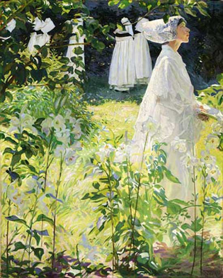
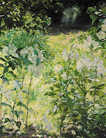
On to the painting I chose. A Convent Garden, Brittany is set in Concarneau at a hospital run by the Sisters of the Holy Ghost. Leech was there in 1904 while recovering from typhoid fever. In 1911, he painted The Secret Garden from drawings he made at the time. His leafy lilies are painted with vivid energy and life, but at the same time, the brushstrokes seem to break down into pattern.
Convent Garden is basically Secret Garden with nuns. Plant life frames and partially obscures a novice holding a prayer book. She’s dressed in a traditional Breton wedding dress, a custom marking the day a novice takes her final vows. Her little clearing is bathed in light, but it’s surrounded by shade. A group of older nuns seems to be walking away in the background. The whole scene makes me feel like I’m eavesdropping, hiding in the lilies. The energy of the plants contrasts with the stillness of the novice and creates a sense of tension. It’s as if you’re witnessing this pivotal, highly private moment in time. The painting pulls you in, yet keeps you at a distance.
The model for the novice is Leech’s first wife Elizabeth Saurine Kerlin. When the couple first met, Elizabeth was married to another man, but by 1912, she had gotten a divorce, leaving her free to marry Leech. When we consider this new information, Convent Garden becomes a wedding portrait. A young bride surrounded by beautiful white lilies, symbols for purity and promise.
But the artist I fell in love with was William John Leech (I probably would have picked Harry Clarke, but he’s a prolific illustrator and stained glass artist, and the magnitude of his oeuvre overwhelmed me).
![]() |
| William John Leech, A Convent Garden, Brittany, 1913, oil on canvas, 132 x 106 cm. |
William Leech was born in Dublin in 1881. He studied under Walter Osborn (yet another Irish artist!), but didn’t actually do much work in Ireland. He went to France, painted in Brittany, and eventually settled in England. I’m mostly interested in his work in Brittany. Or the work he made around that time at least. It’s bright, and thick, and juicy. A wonderful mix of the impressionism of van Gogh and the finish of John Singer Sargent. Any earlier and his paintings are a bit too dark and traditional. I’m not really sure why I don’t like his later stuff as much though. It just doesn’t have the same draw.
Right: Vincent van Gogh, Undergrowth with Two Figures, 1890, oil on canvas, 49.5 x 99.7 cm
Left: John Singer Sargent, Carnation, Lily, Lily, Rose, 1886, oil on canvas, 174 x 153.7 cm.
On to the painting I chose. A Convent Garden, Brittany is set in Concarneau at a hospital run by the Sisters of the Holy Ghost. Leech was there in 1904 while recovering from typhoid fever. In 1911, he painted The Secret Garden from drawings he made at the time. His leafy lilies are painted with vivid energy and life, but at the same time, the brushstrokes seem to break down into pattern.
![]() |
| William John Leech, The Secret Garden, 1911, oil on canvas, 112 x 86.5 cm. |
Convent Garden is basically Secret Garden with nuns. Plant life frames and partially obscures a novice holding a prayer book. She’s dressed in a traditional Breton wedding dress, a custom marking the day a novice takes her final vows. Her little clearing is bathed in light, but it’s surrounded by shade. A group of older nuns seems to be walking away in the background. The whole scene makes me feel like I’m eavesdropping, hiding in the lilies. The energy of the plants contrasts with the stillness of the novice and creates a sense of tension. It’s as if you’re witnessing this pivotal, highly private moment in time. The painting pulls you in, yet keeps you at a distance.
The model for the novice is Leech’s first wife Elizabeth Saurine Kerlin. When the couple first met, Elizabeth was married to another man, but by 1912, she had gotten a divorce, leaving her free to marry Leech. When we consider this new information, Convent Garden becomes a wedding portrait. A young bride surrounded by beautiful white lilies, symbols for purity and promise.
Wednesday, February 27, 2013
Bush's Bathroom
Last week was President’s Day, and I’m celebrating by bringing you the paintings of former United States president George W. Bush. “Aren’t you a bit late?” you may ask. Yes, a bit. Bush’s new hobby has been all over TV, in the latest issue of The Week, and even favorably reviewed by everyone’s favorite art critic Jerry Saltz. And it’s also not President’s Day anymore. But I came across a website counting down the seconds until the meaning behind the art of Gorge W. Bush is revealed. Right now, it’s at 00 weeks 02 days 16 hours 47 minutes and 32 seconds. So there you go. There’s still time before the story really breaks.
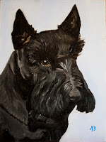
If you haven’t already heard about Bush’s art, here’s the situation. On October 14, New York Magazine reported that our 43rd president had “taken up painting, making portraits of dogs and arid Texas landscapes.” On February 1, we got to see one of these dog paintings first hand on Laura and George’s respective Facebook pages. It was a portrait of the Bushs’ late Scottish Terrier Barney, and it was surprisingly good. Although it’s a bit hard to figure out where the fur ends and a black dog sweater begins, Bush handles Barney’s fur, ears, and eye like a pro. Or at least like an art school freshman experimenting with impressionistic doggy portraiture.
Anyway, on to the scandalous part. Early this month some dude (chick?) calling him(her?)self Guccifer hacked into a Bush family computer. It wasn’t all fun and games. He (she?) got security codes, addresses, phone numbers, and incredibly personal information. Including a horrible photo of Bush Senior in the hospital and plans for his funeral. It was bad. The FBI has launched a criminal investigation.
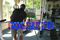
But what we’re interested in is not Bush 41’s health scare or clandestine information. It’s the art. There was a photo of Bush painting a picture of St. Ann’s Episcopal Church in Kennebunkport, Maine, but we’re going to ignore this painting too. It’s tiny, hard to see, and boring. Although it is interesting to note that Bush paints in the midst of exercise equipment.
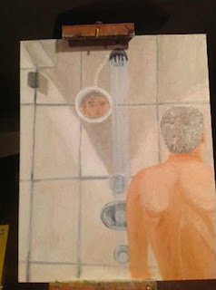
No, Guccifer found the true treasures in an email from Bush to his sister Dorothy. They appear to be self-portraits. Naked. In a bathroom.
The first shows our former president standing in the shower, his back to us. It’s not sophisticated. In fact, it’s awkward and naive. Bush isn’t under the water. He’s facing the wrong direction, standing so close to the wall he looks like a toddler in time-out. And the apparent reflection of his face in the mirror just below the shower head is totally impossible. Not to mention those back muscles.
But the painting does have something going for it. For one, I sort of like the angle and shadows created by the glass of the shower door (see the hinge in the top left?). Beyond that though, it has an interesting emotional impact. It’s unnervingly bizarre, and yet so mundane and thoughtful that we actually start to empathize with Bush. It’s like he’s a real human being, taking showers just like the rest of us.
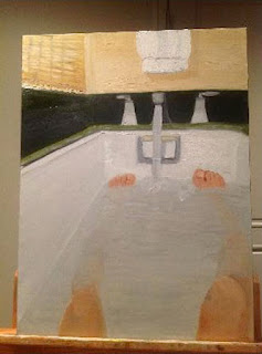
The second painting has all the emotion of the first, but with the added bonus of showing some formal artistic potential (I chose this one!). The knees could use a little work, but I really like the toes and hint of leg beneath the water. But mostly I like the depth. The angles of the walls and the tub, although off, really lead you into the painting. And did you see the faucet? While it looks more like a sink faucet than one on a bathtub, the tuned handle, the contrast of light and shadow, and even the stream of water are actually pretty good. Plus, I always love art made from the perspective of the subject. It’s like you’re inside the painting.
Everyone’s been trying to psychoanalyze these paintings, making connections to Hurricane Katrina, waterboarding, and even gay marriage (they assumed the reflection in the shower painting was of some other dude standing behind Bush). But Bush is just one more painting politician in the company of Dwight D. Eisenhower, Winston Churchill, and Hitler. And in the end, I’m not sure I should be the one to judge him. I can’t remember what I was thinking, but even I once made a naked shower painting.
![]() |
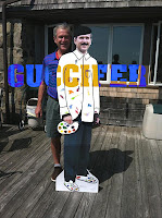
| George W. Bush, the Artist |
If you haven’t already heard about Bush’s art, here’s the situation. On October 14, New York Magazine reported that our 43rd president had “taken up painting, making portraits of dogs and arid Texas landscapes.” On February 1, we got to see one of these dog paintings first hand on Laura and George’s respective Facebook pages. It was a portrait of the Bushs’ late Scottish Terrier Barney, and it was surprisingly good. Although it’s a bit hard to figure out where the fur ends and a black dog sweater begins, Bush handles Barney’s fur, ears, and eye like a pro. Or at least like an art school freshman experimenting with impressionistic doggy portraiture.
![]() |
| Bush apparently signs his work "43" |
Anyway, on to the scandalous part. Early this month some dude (chick?) calling him(her?)self Guccifer hacked into a Bush family computer. It wasn’t all fun and games. He (she?) got security codes, addresses, phone numbers, and incredibly personal information. Including a horrible photo of Bush Senior in the hospital and plans for his funeral. It was bad. The FBI has launched a criminal investigation.
But what we’re interested in is not Bush 41’s health scare or clandestine information. It’s the art. There was a photo of Bush painting a picture of St. Ann’s Episcopal Church in Kennebunkport, Maine, but we’re going to ignore this painting too. It’s tiny, hard to see, and boring. Although it is interesting to note that Bush paints in the midst of exercise equipment.
![]() |
| He looks like he’s about to play tennis |
No, Guccifer found the true treasures in an email from Bush to his sister Dorothy. They appear to be self-portraits. Naked. In a bathroom.
The first shows our former president standing in the shower, his back to us. It’s not sophisticated. In fact, it’s awkward and naive. Bush isn’t under the water. He’s facing the wrong direction, standing so close to the wall he looks like a toddler in time-out. And the apparent reflection of his face in the mirror just below the shower head is totally impossible. Not to mention those back muscles.
But the painting does have something going for it. For one, I sort of like the angle and shadows created by the glass of the shower door (see the hinge in the top left?). Beyond that though, it has an interesting emotional impact. It’s unnervingly bizarre, and yet so mundane and thoughtful that we actually start to empathize with Bush. It’s like he’s a real human being, taking showers just like the rest of us.
The second painting has all the emotion of the first, but with the added bonus of showing some formal artistic potential (I chose this one!). The knees could use a little work, but I really like the toes and hint of leg beneath the water. But mostly I like the depth. The angles of the walls and the tub, although off, really lead you into the painting. And did you see the faucet? While it looks more like a sink faucet than one on a bathtub, the tuned handle, the contrast of light and shadow, and even the stream of water are actually pretty good. Plus, I always love art made from the perspective of the subject. It’s like you’re inside the painting.
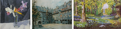
Everyone’s been trying to psychoanalyze these paintings, making connections to Hurricane Katrina, waterboarding, and even gay marriage (they assumed the reflection in the shower painting was of some other dude standing behind Bush). But Bush is just one more painting politician in the company of Dwight D. Eisenhower, Winston Churchill, and Hitler. And in the end, I’m not sure I should be the one to judge him. I can’t remember what I was thinking, but even I once made a naked shower painting.
![]() |
| Can you tell which politician did which painting? |
Saturday, February 16, 2013
Ch-ch-changes
It's not often that I get the chance to post about one of my choices being reworked. I guess that comes with the "living artist" territory.
Anyway, after deinstalling her Eastern State Penitentiary windows, Judith Schaechter added borders and expanded compositions. For the Con/Fines windows (including my favorite, Mary Magdalene), she created thick, stone-like stained glass frames that make the original centers seem cramped and isolated, but in a good way. While the context of Eastern State really made these pieces, and I think I may have preferred their unaltered state, I get that they needed a little something to highlight their fundamental concept and make them stand-alone works.
What do you think!?
To see the changes Schaechter made to her Eastern State Penitentiary windows, read her blog at judithschaechterglass.blogspot.com
Anyway, after deinstalling her Eastern State Penitentiary windows, Judith Schaechter added borders and expanded compositions. For the Con/Fines windows (including my favorite, Mary Magdalene), she created thick, stone-like stained glass frames that make the original centers seem cramped and isolated, but in a good way. While the context of Eastern State really made these pieces, and I think I may have preferred their unaltered state, I get that they needed a little something to highlight their fundamental concept and make them stand-alone works.
What do you think!?
To see the changes Schaechter made to her Eastern State Penitentiary windows, read her blog at judithschaechterglass.blogspot.com
Sunday, February 10, 2013
Munch's Madness
A couple of weeks ago, I went to New York City to see three exhibitions: The Art of Scent at the Museum of Art and Design, and Inventing Abstraction and The Scream at the Museum of Modern Art. So today, I figured I’d talk about my favorite Munch. Surprise, surprise, it’s The Scream. Just not exactly the Scream that I saw.
We all know The Scream. It’s iconic. Andy Warhol did a series of silkscreens reproducing it along with other Munch works, The Simpsons parodied it, and the ubiquitous scream mask featured in the Scream movies and sold in just about every store around Halloween is based on it. They even sell screaming Scream pillows on the internet (I have one). And now, until April 29, you can see The Scream at MoMA up close and personal (ignoring the plexiglas barrier and the throngs of people).
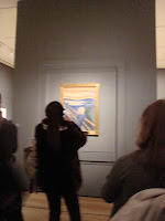
But one thing most of us don’t know is that there are four versions of The Scream. And that’s not counting the lithograph or the Munch works that have eerily similar subjects or compositions. The four works I’m talking about are so similar that, except for differences in media, they’re nearly identical. The version at MoMA is Munch’s pastel Scream from 1895. But like I said, that one’s not my favorite. My favorite is the 1893 tempera and crayon version. I’ll tell you why and talk about all of the versions a little later. First, I want to cover what they have in common.
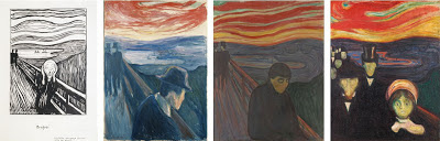
The Scream (the hypothetical conglomerate of all the versions) was originally titled Der Schrei der Natur, or The Scream of Nature, and is one (four) of the most emotionally powerful works of art out there. It’s set in Ekeburg, Norway looking out onto the Oslofjord and the cityscape of Oslo, and, if we take Munch’s diary entries at face value, it’s based on an actual experience.
But that’s where the resemblance to the real world stops and distortion begins. Some art historians think that Munch may have based The Scream’s sky on vibrant ash-induced sunsets after the Krakatau eruption in 1883 and the central figure on a mummy he may have seen. But I think that’s all silly speculation and doesn’t really matter one way or the other. Munch was a symbolist master and a precursor of the expressionist movement. He was using distorted, simplified forms, shallow, stage-like compositions, and “arbitrary” color (like van Gogh) to convey an emotional experience. He wasn’t going for realism. He painted a pasty, hairless, skull-faced man with no spine wearing a shapeless robe for God’s sake!
And Munch had plenty of emotion to work from. In addition to the typical fin de siècle anxieties, his mother and sister died when he was young, his father was a weirdo, and Munch himself was prone to excessive drunken “brawling.” Not far from the setting of The Scream, there was also a mental institution where another sister was locked up and a slaughterhouse that was said to be pretty hellish. Oh, and apparently the area was fairly popular for suicide.
The little known fact that The Scream was originally conceived as part of Munch’s Frieze of Life series shows just how mucked up Munch’s perceptions were. The series was made up of themes of love, angst, and death. The Scream was the culminating work in love. Munch believed that the ultimate outcome of love was despair.
Now back to the different versions. Munch supposedly made multiples because he found it hard to part with his work. We don’t know which one came first. It was either my favorite (the tempera and crayon version) or the Munch Museum’s crayon only Scream. Both were done in 1893. I’m going to guess that it might have been the crayon only one though, since it’s rougher and more washed out. Like a preliminary sketch. But I’m probably wrong.
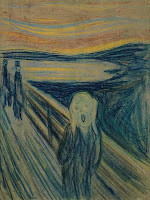
My favorite Scream is in Norway’s National Gallery, so I probably won’t be able to see it in person any time soon. But I managed to get my hands on a relatively large digital image, and just that takes my breath away. As a whole, the National Gallery’s version is the most put together. When you look close though, you can see how a mess of separate brushstrokes, washes, and lines work together to create the whole. I love how casual and irreverent each mark is. Even the white spatters in the lower right corner that look like bird poop are fantastic. I also think the figures in the background of this version are the best. Their tall, upright bodies and nearly invisible heads make them seem ghostly and mysterious.
The Scream currently at MoMA came two years later. It’s the most colorful, but it’s a bit too crisp for me. The comparatively sharp lines and the virtual rainbow of color make it seem somewhat cartoony. It does have a unique hand painted frame going for it though. It’s the only original frame left, and Munch wrote a poem on it describing his experience in Ekeburg!
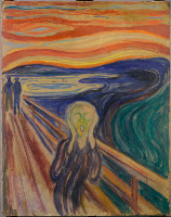
The last Scream is also in the Munch Museum in Oslo and was done in tempera in 1910. Like the crayon version, it seems a bit rough. But it works. The flowing lines (look at those hands!) and the vacant, eyeless face makes it the most emotionally expressive of the bunch.
In the end, it’s hard to distinguish quality and admiration from familiarity. I know I like The Scream, but if I hadn’t grown up with it would I have chosen it as my favorite? I can’t tell. But I will say one thing: On the other side of the wall The Scream is hung on at MoMA is Munch’s Madonna. I was surprised how drawn to it I was, and since everyone was crowded around The Scream, I got it all to myself.
The Scream I saw vs. The Scream I chose
We all know The Scream. It’s iconic. Andy Warhol did a series of silkscreens reproducing it along with other Munch works, The Simpsons parodied it, and the ubiquitous scream mask featured in the Scream movies and sold in just about every store around Halloween is based on it. They even sell screaming Scream pillows on the internet (I have one). And now, until April 29, you can see The Scream at MoMA up close and personal (ignoring the plexiglas barrier and the throngs of people).
| What you'll see at MoMA |
But one thing most of us don’t know is that there are four versions of The Scream. And that’s not counting the lithograph or the Munch works that have eerily similar subjects or compositions. The four works I’m talking about are so similar that, except for differences in media, they’re nearly identical. The version at MoMA is Munch’s pastel Scream from 1895. But like I said, that one’s not my favorite. My favorite is the 1893 tempera and crayon version. I’ll tell you why and talk about all of the versions a little later. First, I want to cover what they have in common.
![]() |
| The Scream lithograph and other similar Munch works (Despair 1892, Despair 1894, and Anxiety) |
The Scream (the hypothetical conglomerate of all the versions) was originally titled Der Schrei der Natur, or The Scream of Nature, and is one (four) of the most emotionally powerful works of art out there. It’s set in Ekeburg, Norway looking out onto the Oslofjord and the cityscape of Oslo, and, if we take Munch’s diary entries at face value, it’s based on an actual experience.
I was walking along the road with two friends. The sun set. I felt a tinge of melancholy. Suddenly the sky became a bloody red. I stopped, leaned against the railing, dead tired. And I looked at the flaming clouds that hung like blood and a sword over the blue-black fjord and city. My friends walked on. I stood there, trembling with fright. And I felt a loud, unending scream piercing nature.
But that’s where the resemblance to the real world stops and distortion begins. Some art historians think that Munch may have based The Scream’s sky on vibrant ash-induced sunsets after the Krakatau eruption in 1883 and the central figure on a mummy he may have seen. But I think that’s all silly speculation and doesn’t really matter one way or the other. Munch was a symbolist master and a precursor of the expressionist movement. He was using distorted, simplified forms, shallow, stage-like compositions, and “arbitrary” color (like van Gogh) to convey an emotional experience. He wasn’t going for realism. He painted a pasty, hairless, skull-faced man with no spine wearing a shapeless robe for God’s sake!
And Munch had plenty of emotion to work from. In addition to the typical fin de siècle anxieties, his mother and sister died when he was young, his father was a weirdo, and Munch himself was prone to excessive drunken “brawling.” Not far from the setting of The Scream, there was also a mental institution where another sister was locked up and a slaughterhouse that was said to be pretty hellish. Oh, and apparently the area was fairly popular for suicide.
The little known fact that The Scream was originally conceived as part of Munch’s Frieze of Life series shows just how mucked up Munch’s perceptions were. The series was made up of themes of love, angst, and death. The Scream was the culminating work in love. Munch believed that the ultimate outcome of love was despair.
Now back to the different versions. Munch supposedly made multiples because he found it hard to part with his work. We don’t know which one came first. It was either my favorite (the tempera and crayon version) or the Munch Museum’s crayon only Scream. Both were done in 1893. I’m going to guess that it might have been the crayon only one though, since it’s rougher and more washed out. Like a preliminary sketch. But I’m probably wrong.
![]() |
| Edvard Munch, The Scream, 1893, crayon on cardboard, 74 x 56 cm. |
My favorite Scream is in Norway’s National Gallery, so I probably won’t be able to see it in person any time soon. But I managed to get my hands on a relatively large digital image, and just that takes my breath away. As a whole, the National Gallery’s version is the most put together. When you look close though, you can see how a mess of separate brushstrokes, washes, and lines work together to create the whole. I love how casual and irreverent each mark is. Even the white spatters in the lower right corner that look like bird poop are fantastic. I also think the figures in the background of this version are the best. Their tall, upright bodies and nearly invisible heads make them seem ghostly and mysterious.
The Scream currently at MoMA came two years later. It’s the most colorful, but it’s a bit too crisp for me. The comparatively sharp lines and the virtual rainbow of color make it seem somewhat cartoony. It does have a unique hand painted frame going for it though. It’s the only original frame left, and Munch wrote a poem on it describing his experience in Ekeburg!
The last Scream is also in the Munch Museum in Oslo and was done in tempera in 1910. Like the crayon version, it seems a bit rough. But it works. The flowing lines (look at those hands!) and the vacant, eyeless face makes it the most emotionally expressive of the bunch.
![]() |
| Edvard Munch, The Scream, 1910, tempra on cardboard, 83.5 x 66 cm. |
In the end, it’s hard to distinguish quality and admiration from familiarity. I know I like The Scream, but if I hadn’t grown up with it would I have chosen it as my favorite? I can’t tell. But I will say one thing: On the other side of the wall The Scream is hung on at MoMA is Munch’s Madonna. I was surprised how drawn to it I was, and since everyone was crowded around The Scream, I got it all to myself.
But I think I may like this 1894 painted version better than MoMA's lithograph and woodcut.

Saturday, February 9, 2013
Schaechter Side Note
A new post will be up later today, but first I wanted to let everyone know that it is a small world after all.
I made a discovery while researching my last blog post that I find interesting (although I may be the only one):
Judith Schaechter and my father-in-law were in a show together at an art gallery I worked at a couple of summers ago!
Learn more, and check out some images here!
I made a discovery while researching my last blog post that I find interesting (although I may be the only one):
Judith Schaechter and my father-in-law were in a show together at an art gallery I worked at a couple of summers ago!
Learn more, and check out some images here!
Saturday, January 19, 2013
Schaechter's Windows
I love oil paint. It’s slow drying and easier (for me) to work with than acrylics. Plus it’s got a sense of luminosity and depth that I can’t get enough of. But there’s one medium that’s more radiant and jewel-like than oil: Stained Glass.
I really want to learn how to work with stained glass, but today I’m going to do the next best thing. I’m going to talk to you about Judith Schaechter, a Philadelphia based stained glass artists with works in the Victoria and Albert Museum, the Metropolitan Museum of Art, and my very own Corning Museum of Glass.
Oh, and she’s also alive. At this point, I might as well get rid of my “no living artists” rule altogether. I seem to be breaking it a lot.
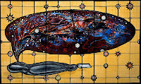
Taking Schaechter’s works at face value, I would have chosen Body Bag, a work that depicts a speech-bubble-like mass containing layered images of dinosaur bones, bodies, and constellations emerging from a slightly unzipped body bag. It’s as if a corpse were dreaming or the soul returning to the primordial cosmos of life. Like many of Schaechter’s works, it’s beautifully comic, dark, ambiguous, and evocative all at once. And I love the contrast between the flat, geometric background and the deep, flowing forms of the bubble.
But like most of Schaechter’s stained glass windows, Body Bag isn’t really a window. It’s a panel installed in a light box. It has no permanent context, and the unchanging artificial light makes it look more like a television or computer screen than a window. So, when I read about Schaechter’s installation at Philadelphia’s Eastern State Penitentiary, I chose a work from that instead.
Eastern State Penitentiary opened in 1829 as an innovative new prison dedicated to “confinement in solitude with labor.” While prisoners had regular contact with wardens, guards, and, oddly enough, tourists, there was no inter-prisoner-mingling and no visits from family or friends. For the most part, prisoners were left alone with their thoughts in the hopes that they would reflect on their past and repent. Hence the word “penitentiary.” But all things must end. Eastern State closed in 1971 and is now a National Historic Landmark and museum.
Schaechter’s artist installation opened in early 2012 and was titled The Battle of Carnival and Lent after the show’s centerpiece, a large transom window outside cellblock 11 (itself named for the Bruegel painting). The installation also consisted of 16 other stained glass windows inspired by Eastern State’s bleak history and addressing “the psychological boarder territory between ‘spiritual aspiration’ and human suffering.” I only learned about the installation last week, and I’m upset about it. It was deinstalled December 3. I missed it by less than a month and a half.
The work I chose is Mary Magdalene, part of a group of ten narrow stained glass skylights called Con/Fines. The group was located in cellblock 8 and depicts five mythic “prisoners,” including Prometheus, Atlas, Andromeda, and Noah, paired with five ornamental windows. The windows’ odd dimensions enhance the feeling of imprisonment and struggle. Although Schaechter typically avoids cropping the human form, I’m glad she did here. Having bits and pieces go off the picture plane makes the windows seem more vibrant and dynamic.
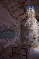
Mary Magdalene itself depicts a window at Eastern State Penitentiary, complete with the decaying walls of the cell around it. Magdalene lies naked and limp on a bare mattress as the shadows of the bars criss-cross her body. She seems to have given up, succumbing to her suffering and becoming one with her meager surroundings. When we look at Mary within the context of the cell, the real cell, where the window was installed, the presence of an absent prisoner joining Mary in captivity seems palpable. Crumbling walls and an empty bed frame mirror Mary’s composition. It’s ghostly. The whole scene seems suspended in time.
But it’s not all as dark and depressing as it may appear. The presence of the stained glass, and the traditional associations that come with it, transformed Eastern State, if not into a sort of church, at least into a space of spiritual awakening. Then there’s the strong focus on the sky. Birds and the weather play a big role in the Con/Fines series, since they would have been something the prisoners themselves could see from their little windows. In fact, each of the figurative windows focuses on a different weather condition (Mary’s is the clear, starry sky). And because the windows are skylights, viewers had to look up to see them, a gesture that is uplifting even on its own. Through Schaechter’s installation, the prison became a cathedral and the cells became the personal chapels of the men and women (although mostly men) that occupied them, each with their own ray of hope and redemption shining down.
And that’s what I like best about Mary Magdalene and Schaechter’s Eastern State Penitentiary installation as a whole. The art highlights the history. It’s an entry point, guiding us in, but willing to relinquish the spotlight to the unlikely inspiration found in a place darkened by despair.
For more information on Judith Schaechter and her art check out her blog at http://judithschaechterglass.blogspot.com!
I really want to learn how to work with stained glass, but today I’m going to do the next best thing. I’m going to talk to you about Judith Schaechter, a Philadelphia based stained glass artists with works in the Victoria and Albert Museum, the Metropolitan Museum of Art, and my very own Corning Museum of Glass.
Oh, and she’s also alive. At this point, I might as well get rid of my “no living artists” rule altogether. I seem to be breaking it a lot.
Taking Schaechter’s works at face value, I would have chosen Body Bag, a work that depicts a speech-bubble-like mass containing layered images of dinosaur bones, bodies, and constellations emerging from a slightly unzipped body bag. It’s as if a corpse were dreaming or the soul returning to the primordial cosmos of life. Like many of Schaechter’s works, it’s beautifully comic, dark, ambiguous, and evocative all at once. And I love the contrast between the flat, geometric background and the deep, flowing forms of the bubble.
![]() |
| Judith Schaechter, Body Bag, stained glass, 71.1 x 119.4 cm. |
But like most of Schaechter’s stained glass windows, Body Bag isn’t really a window. It’s a panel installed in a light box. It has no permanent context, and the unchanging artificial light makes it look more like a television or computer screen than a window. So, when I read about Schaechter’s installation at Philadelphia’s Eastern State Penitentiary, I chose a work from that instead.
Eastern State Penitentiary opened in 1829 as an innovative new prison dedicated to “confinement in solitude with labor.” While prisoners had regular contact with wardens, guards, and, oddly enough, tourists, there was no inter-prisoner-mingling and no visits from family or friends. For the most part, prisoners were left alone with their thoughts in the hopes that they would reflect on their past and repent. Hence the word “penitentiary.” But all things must end. Eastern State closed in 1971 and is now a National Historic Landmark and museum.
Schaechter’s artist installation opened in early 2012 and was titled The Battle of Carnival and Lent after the show’s centerpiece, a large transom window outside cellblock 11 (itself named for the Bruegel painting). The installation also consisted of 16 other stained glass windows inspired by Eastern State’s bleak history and addressing “the psychological boarder territory between ‘spiritual aspiration’ and human suffering.” I only learned about the installation last week, and I’m upset about it. It was deinstalled December 3. I missed it by less than a month and a half.
Judith Schaechter, Mary Magdalene, 2012, stained glass, 119.38 x 11.43 cm.
The work I chose is Mary Magdalene, part of a group of ten narrow stained glass skylights called Con/Fines. The group was located in cellblock 8 and depicts five mythic “prisoners,” including Prometheus, Atlas, Andromeda, and Noah, paired with five ornamental windows. The windows’ odd dimensions enhance the feeling of imprisonment and struggle. Although Schaechter typically avoids cropping the human form, I’m glad she did here. Having bits and pieces go off the picture plane makes the windows seem more vibrant and dynamic.
Mary Magdalene itself depicts a window at Eastern State Penitentiary, complete with the decaying walls of the cell around it. Magdalene lies naked and limp on a bare mattress as the shadows of the bars criss-cross her body. She seems to have given up, succumbing to her suffering and becoming one with her meager surroundings. When we look at Mary within the context of the cell, the real cell, where the window was installed, the presence of an absent prisoner joining Mary in captivity seems palpable. Crumbling walls and an empty bed frame mirror Mary’s composition. It’s ghostly. The whole scene seems suspended in time.
![]() |
| Installation shot from Schaechter's Picasa album. |
But it’s not all as dark and depressing as it may appear. The presence of the stained glass, and the traditional associations that come with it, transformed Eastern State, if not into a sort of church, at least into a space of spiritual awakening. Then there’s the strong focus on the sky. Birds and the weather play a big role in the Con/Fines series, since they would have been something the prisoners themselves could see from their little windows. In fact, each of the figurative windows focuses on a different weather condition (Mary’s is the clear, starry sky). And because the windows are skylights, viewers had to look up to see them, a gesture that is uplifting even on its own. Through Schaechter’s installation, the prison became a cathedral and the cells became the personal chapels of the men and women (although mostly men) that occupied them, each with their own ray of hope and redemption shining down.
And that’s what I like best about Mary Magdalene and Schaechter’s Eastern State Penitentiary installation as a whole. The art highlights the history. It’s an entry point, guiding us in, but willing to relinquish the spotlight to the unlikely inspiration found in a place darkened by despair.
For more information on Judith Schaechter and her art check out her blog at http://judithschaechterglass.blogspot.com!
Subscribe to:
Posts (Atom)